Enterprise Architect Charts and Visualizations
Enterprise Architect Charts and Visualizations
Prolaborate provides a powerful yet intuitive tool for quickly creating rich and dynamic charts and visualizations based on Enterprise Architect model data.
The capabilities of chart widgets will be explained in this guide. Users can create multiple widgets and place it on a dashboard for presenting data to a stakeholder. To know more about the Creation of Dashboard, click here
Prerequisite:
User must have access to EA Repository in Prolaborate.
Admin access is required to create and manage Dashboards.
Types of Charts Supported in Prolaborate


Hierarchical Charts


Add a chart
Adding a chart is a six Step Process
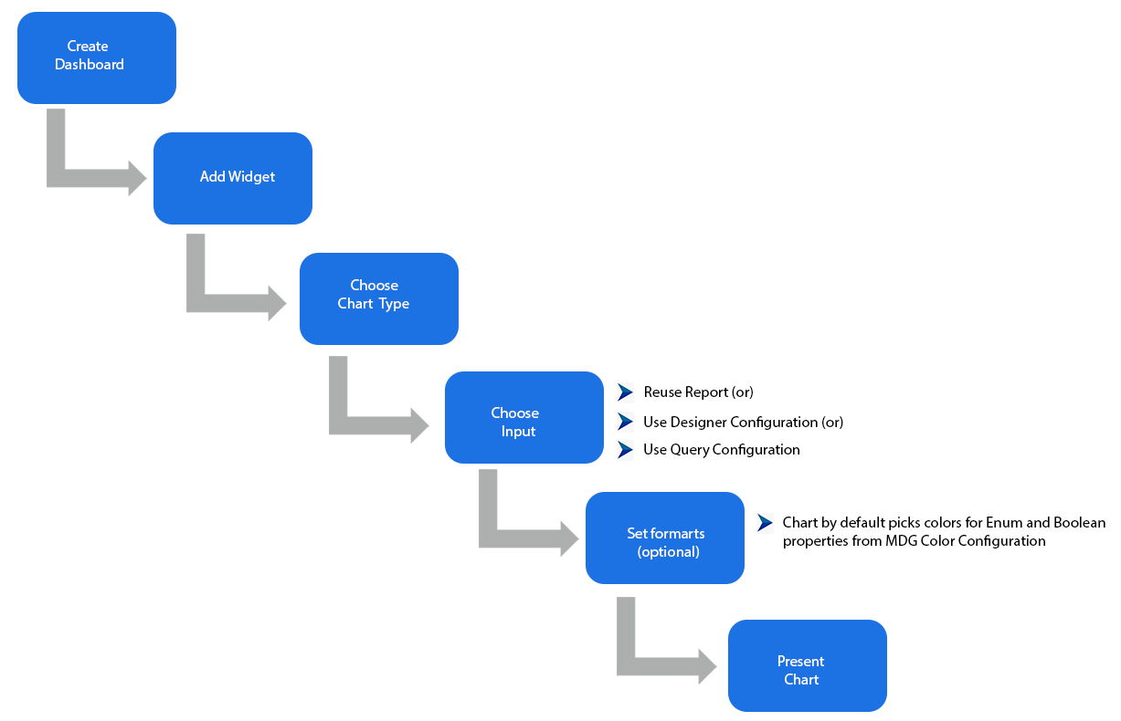


Step 1: Create a Dashboard
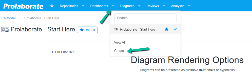
The first step is to create a dashboard which incorporates the charts as a widget. A new dashboard can be created from choosing Create from the dropdown in the header menu.
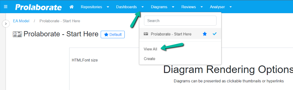
Users can also choose View all to navigate to the dashboard landing page and choose Create Dashboard.
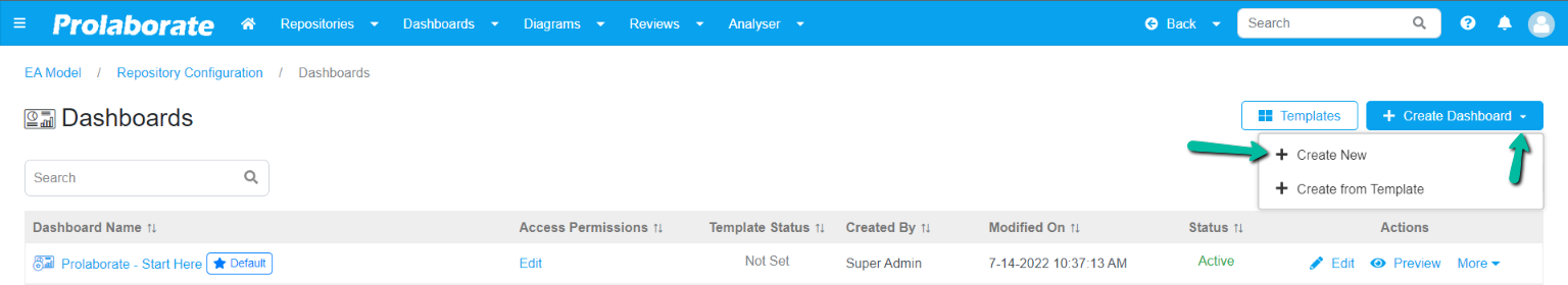
Or click the Dashboards dropdown, then choose Create option from the drop down.
Step 2: Add Widget
To add a widget, click Add Widget Button > Add New.
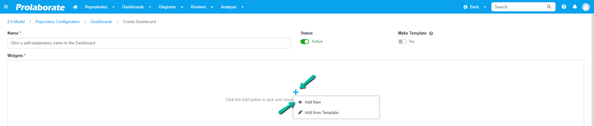
Or Click Add Icon from the bottom right of the page.
In Choose a Widget page, choose Charts under EA widgets and click Add Widget.
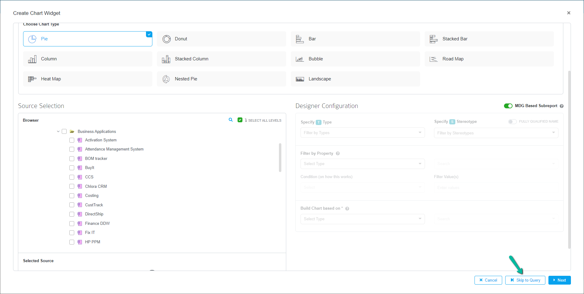
Step 3: Choose chart type
Before selecting Chart type, user gets the list of Reports from Report Configuration.
Initially users get a popup window where users can select a report from the list available and select the option Use Report as shown below. Once selected, user can choose the chart type and the configurations are applied automatically from the selected report.
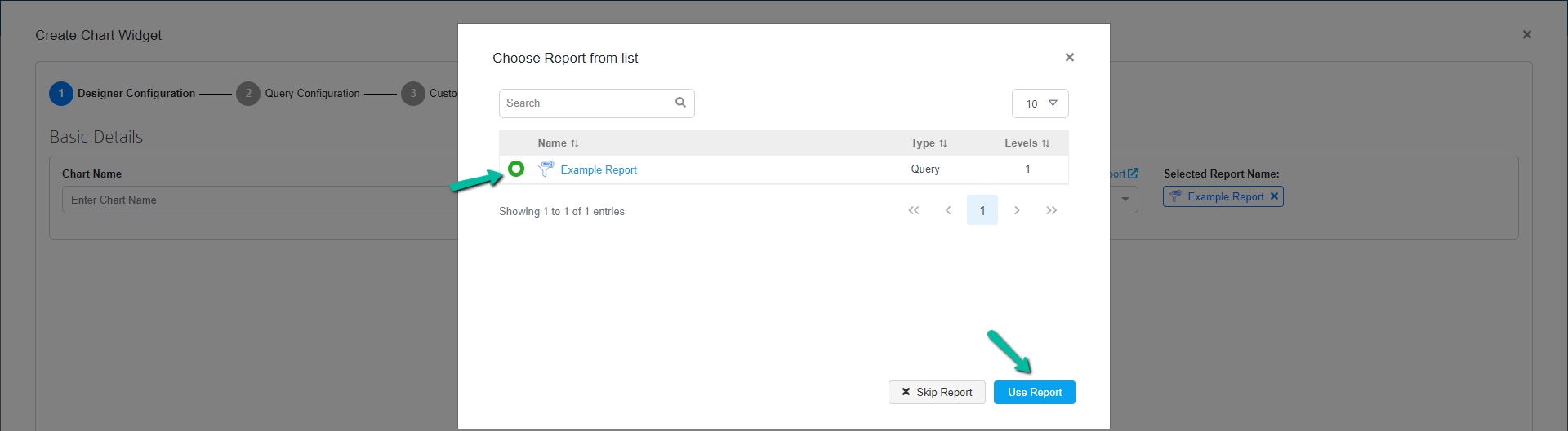
If the user wishes to configure charts manually, select Skip Report option where one can select the chart type and proceed with the configurations.
Step 4: Choose input data
Different options are available as input data when configuring charts in Prolaborate.
Reuse Report
Users who create charts regularly from scratch in Prolaborate, can now save the configuration as a report which allows them to reuse it and create multiple charts with same configuration.
To achieve this, the user needs to create reports using Report Configuration. To learn more about Report Configuration click here
Reports can be exported and imported across repositories in Prolaborate.
Use Designer Configuration
Chart designer allows users to create charts with a few simple clicks by selecting sources and applying filters as required.
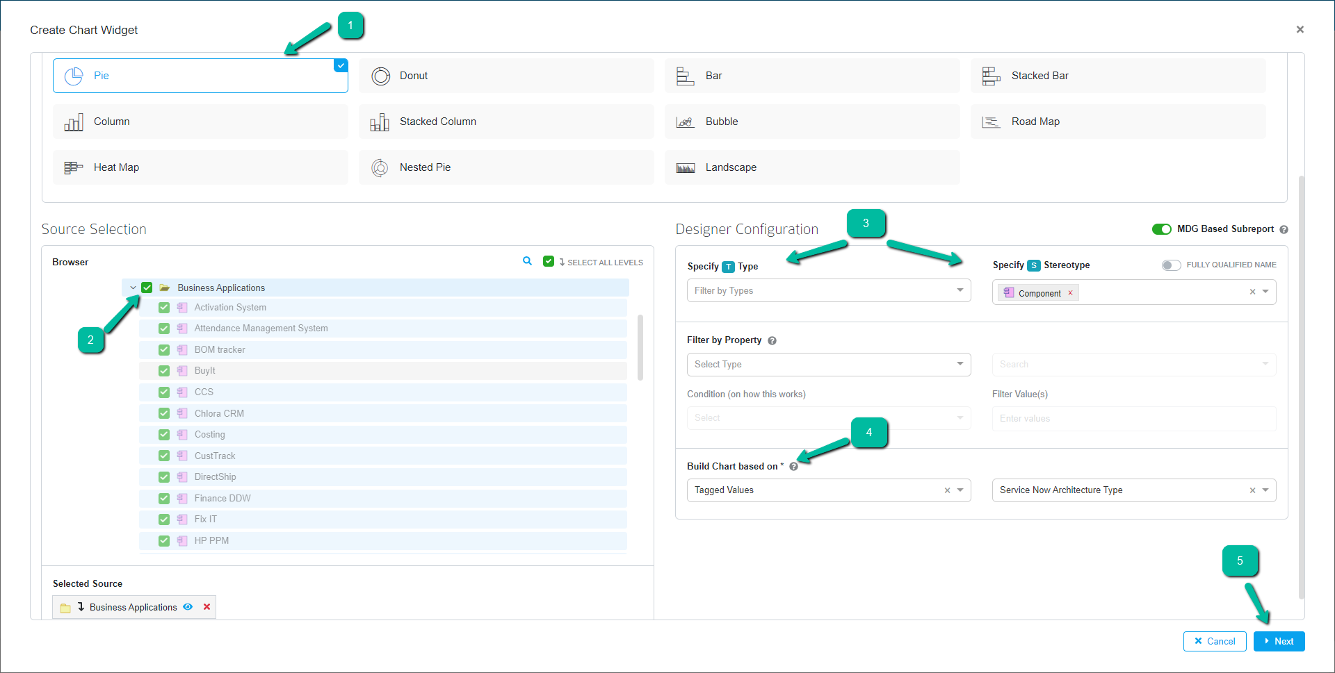
Click Next to view the query generated based on the configurations applied in the designer and click Next to navigate to the chart settings page.
| Field | Description |
|---|---|
| Choose Chart Type | Choose required chart type from the list |
| Source Selection | Choose required package, sub package, etc to create a chart |
| Designer configuration | Here the user can filter and set the required conditions to create the Chart. |
| Specify Type | Select the Object type from the dropdown that is available from the package. |
| Specify Stereotype | Select the stereotype from the dropdown |
| Select the stereotype from the dropdown | User can create chart based on the basic properties i.e., Name, Stereotype, Status, Notes, etc or tagged values |
Use Query Configuration
Choose Chart Type from the list and then click Skip to Query button from bottom of the page to land on the Query Configuration section.
Enter the query in the space provided based on requirements and then click Fetch Result Query to get final result query.
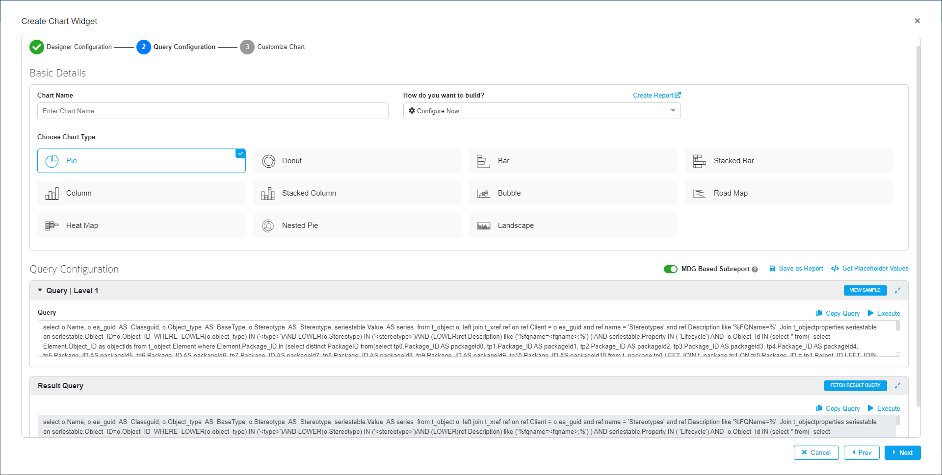
Click Next to navigate to the chart settings page.
Step 5: Chart Format settings
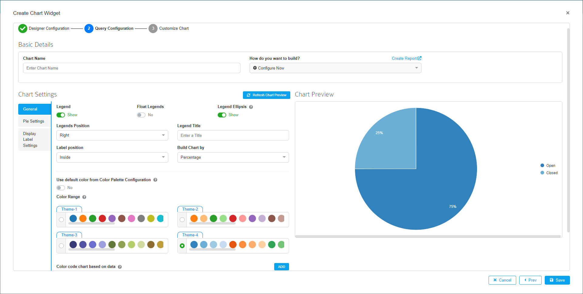
Users can customize the style and feel/aesthetics of the chart on the Chart Settings page. Colors from Color Color Palette Configuration can be used here to grab stakeholder’s attention for information that has more significance. The option Use default color from Color Palette Configuration is enabled by default.
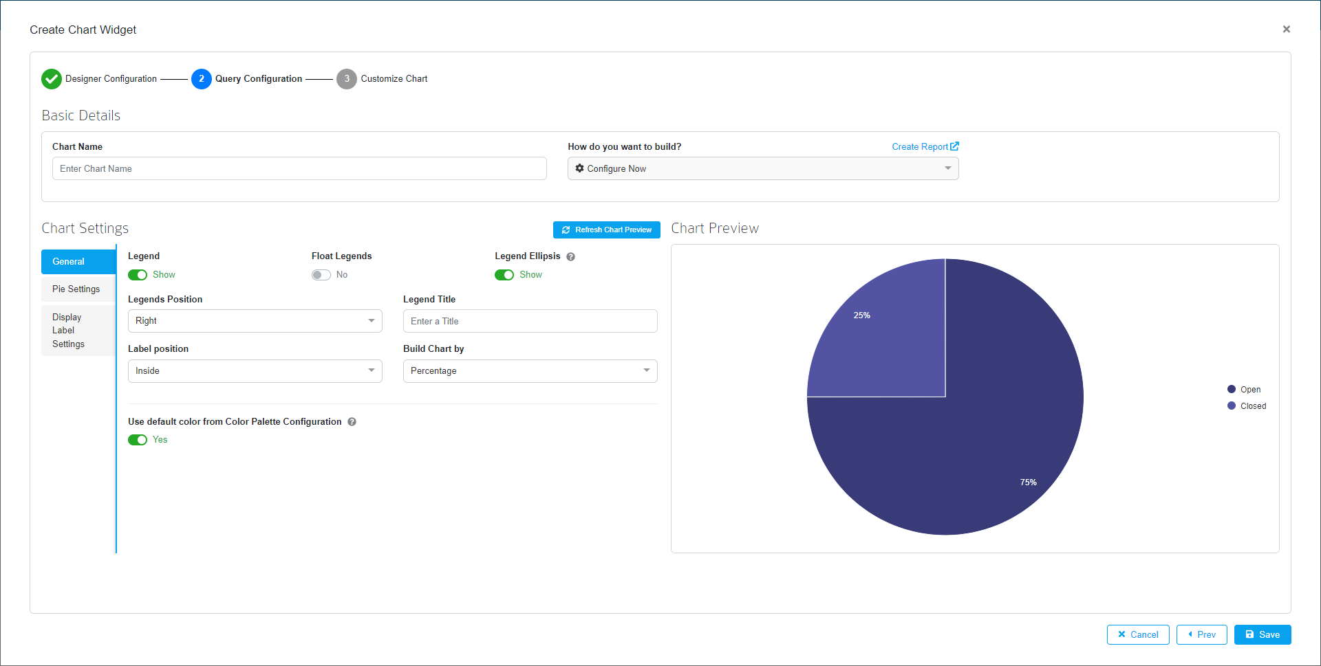
User can also choose a different color range by disabling Use default color from Color Palette Configuration option.
Step 6: Present Chart