
Build Road Map Chart
In Prolaborate, users can build Stacked Column charts by any one of the following methods.
- Build Roadmap Chart using Designer Configuration
- Build Roadmap Chart using SQL Queries
- Build Roadmap Chart using Reports
Build Roadmap Chart using Designer Configuration
Chart designer allows users to create charts with few simple clicks. With a chart designer, charts can be configured by simply selecting the filters. A MDG based sub-report can be added as well to see detailed information by clicking the dissections of the chart.
Chart designer allows users to view the query that was generated by the configurations made, which can be further be edited to create customized charts if required.
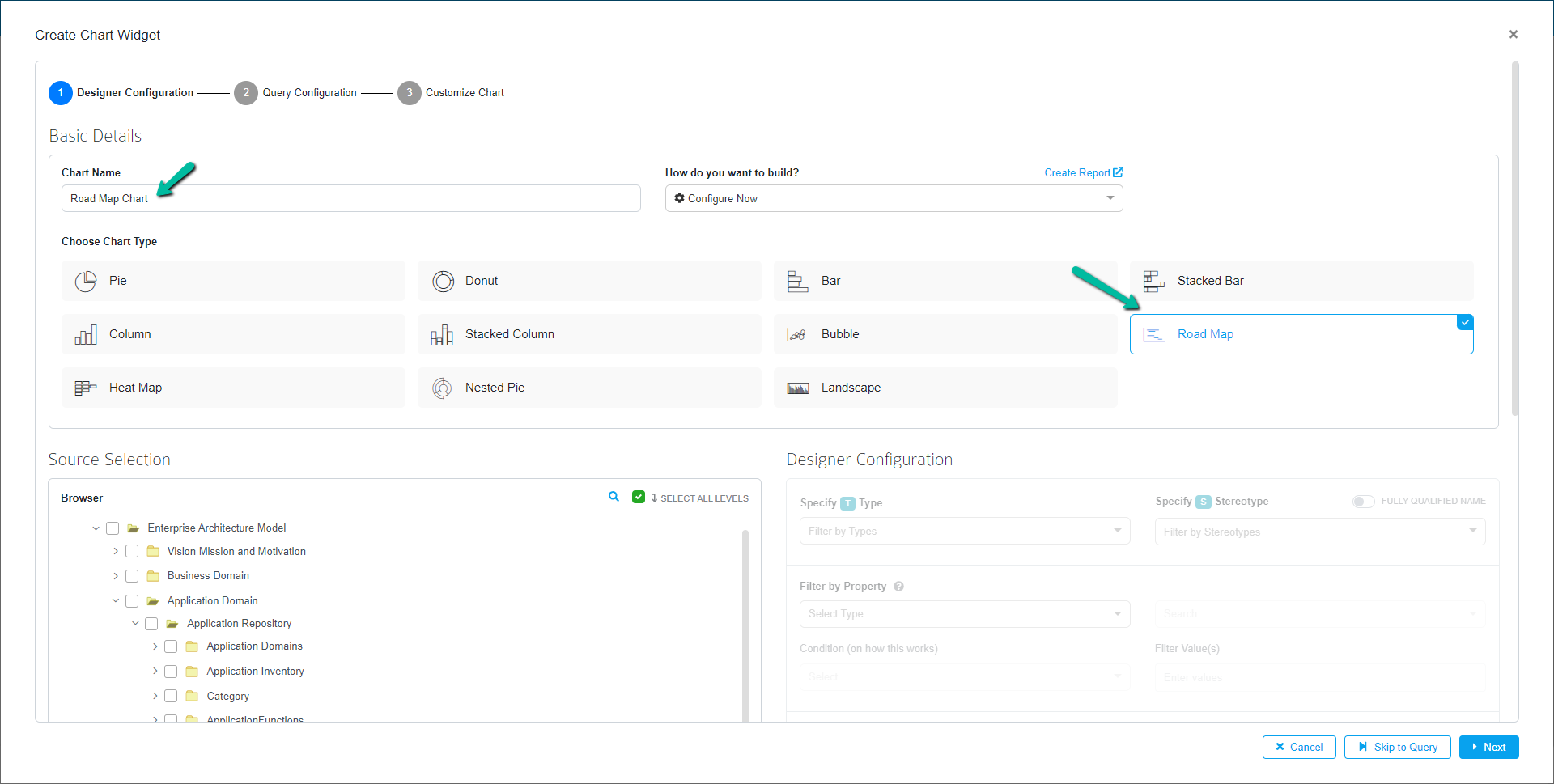
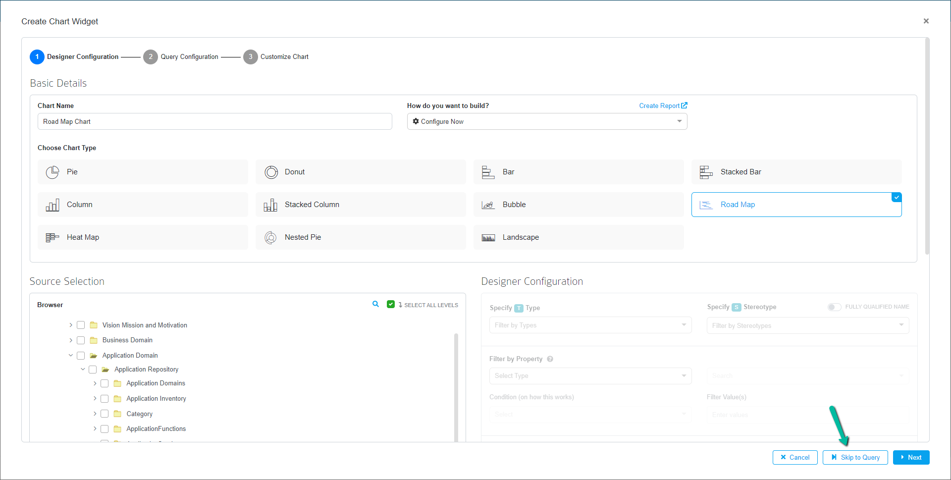
In Create Chart Widget, follow the below steps to create a Roadmap chart using designer configuration.Basic Details
| Field | Description |
|---|---|
| Chart Name | Enter a suitable chart name |
| Choose Chart Type | Choose Roadmap under chart type |


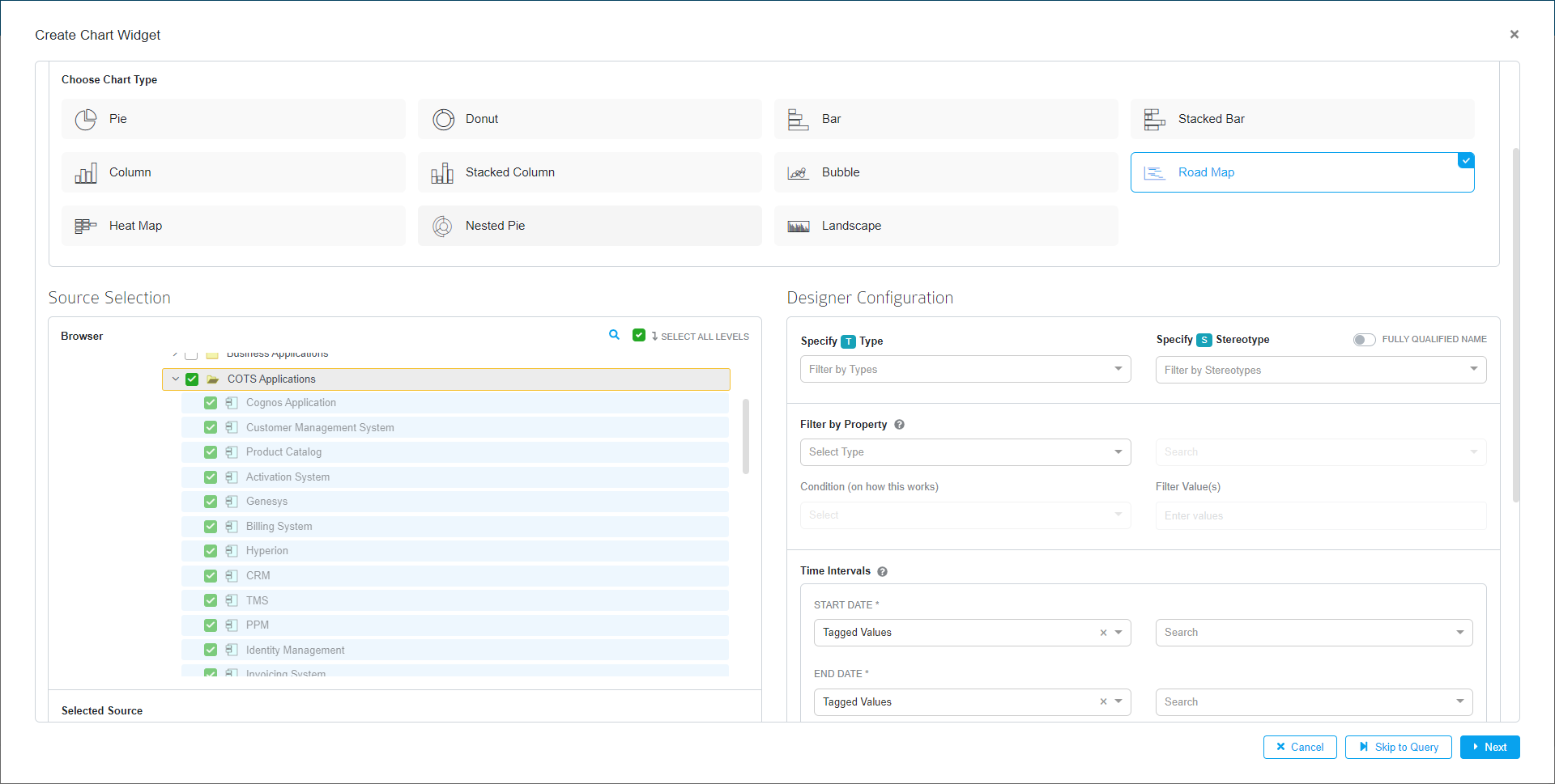
Source Selection
| Field | Description |
|---|---|
| Browser | By clicking on this section, you will be able to view the package |
| Search Repository | To search for packages and elements. Click the Search icon to open the repository search page, where the user can search for elements by name, or the user can choose object type, type, and stereotype from the dropdown menu |
| Select All Levels | When Select All Levels is selected, the sub packages and elements within a package are selected automatically once the user selects the package |
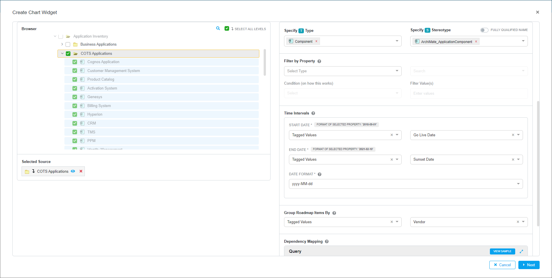
Designer Configuration
This section allows the user to select the configuration needed to create a chart.
| Field | Description |
|---|---|
| Specify Type | Select the Object type from the dropdown that is available from the package |
| Specify Stereotype | Select the stereotype from the dropdown |
| Fully Qualified Name | By enabling this option, one can see the complete name of the Stereotype with its technology. If not enabled, you will be able to see only the name of the Stereotype |
| Filter By Property | You can filter the elements based on the basic properties i.e., Name, Stereotype, Status, Notes, etc, or tagged values Condition (on how this works): User can filter based on the conditions like IN, NOT IN from the tagged value and Basic Properties Filter values: Based on the above Tagged value or Basic Property, user can filter in detail by using the values from the Tagged value or basic property |
| Time Interval | Date Format: Choose the desired date format to be displayed in the road map chart from the drop down Started Date: Choose the start date from tagged value (Date type) to start the time line of the roadmap End Date: Choose the end date from tagged value (Date type) to end the time line of the roadmapbr
|
| Color code Roadmap items based on | Sections will be color coded based on values of basic properties or tagged values selected. Colors will be applied to the chart either from Color Palette or MDG Color Configuration |
| Group Roadmap Items by | Choose the elements which is need to group in roadmap based on the basic properties i.e Name, Stereotype, Status, Notes, etc or tagged values of the elements. |
| Dependency Mapping | By using connected element user can showcase the child element by using this Mapping field. Note: (Use connector attributes in query and list target element) |
After choosing all the filters click Next.
On the query configuration page, the queries for the designer configuration will be displayed. Users can either customize the query if required by enabling the Edit auto-generated query option or copy the query and use it later for customization.
Note:
- Enabling this option will result in loss of traceability between the selected designer configuration from the previous page and the query.
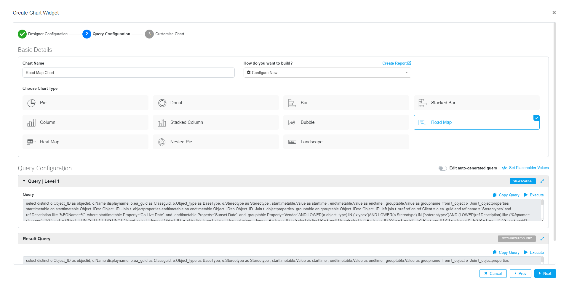
Click Next to navigate to the chart settings page.
Users can customize the style and aesthetics of the chart on the Chart Settings page. We’ll go over each feature in more detail later in this article. Now press the Save button.
Build Roadmap Chart using SQL Queries
In Create Chart Widget, follow the below steps to create a Roadmap chart using SQL Queries.
Basic Details
| Field | Description |
|---|---|
| Chart Name | Enter a suitable chart name |
| Choose Chart Type | Choose Bubble under chart type |
Click Skip to Query option to go straight to the Query Configuration and build the chart by following the below steps.
Query Configuration
This section captures the query required to create the Roadmap chart. This section consists of Query
| Level 1
| Field | Description |
|---|---|
| View Sample | It displays a sample query with the option to see more |
| Query | Enter the query in the space provided based on requirements |
| Copy Query | Click this button to copy the entire query, with no manual selection required |
| Execute | Click on Execute to see the query’s results |
| Set Placeholder Values | Displays the list of placeholders in the query, if there is any. Enter values for the respective placeholders and save them. To know more, click here |
| Save as Report | Save the configurations applied as a report in Report Configuration page where it can be reused again when a new chart is created. To know more, click here |
| Fetch Result Query | Click this button to fetch the result query |
| Result Query | This text box will display the result query upon clicking on the Fetch Result Query |
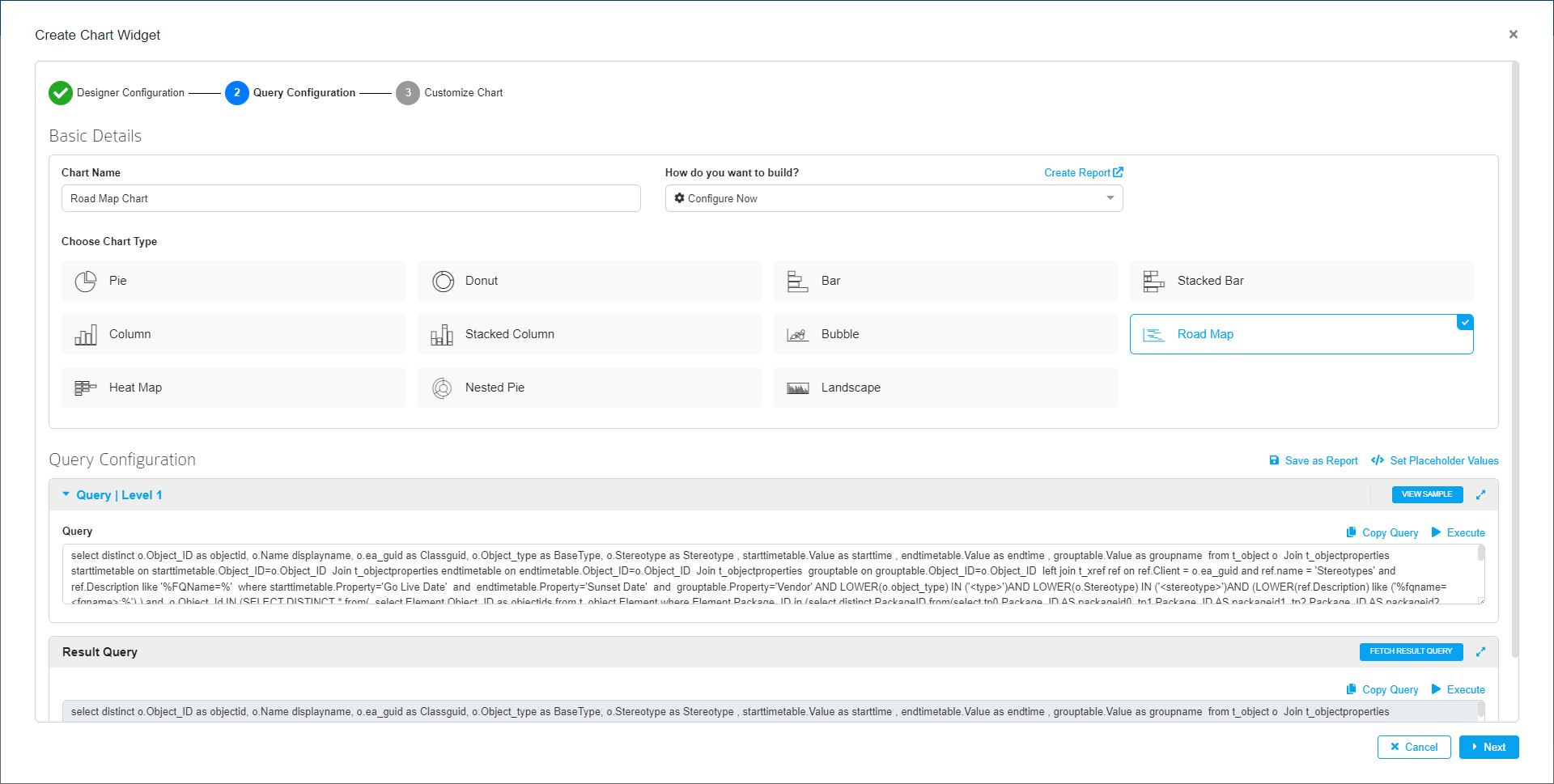
Click Next to navigate to the chart settings page.
Note:
- To apply colors for individual tagged values that are defined using Color Palette Configuration, an alias ‘seriesproperty’ should be mentioned in the query
Users can customize the style and aesthetics of the chart on the Chart Settings page. We’ll go over each feature in more detail later in this article. Now press the Save button.
Build Roadmap Chart using Reports
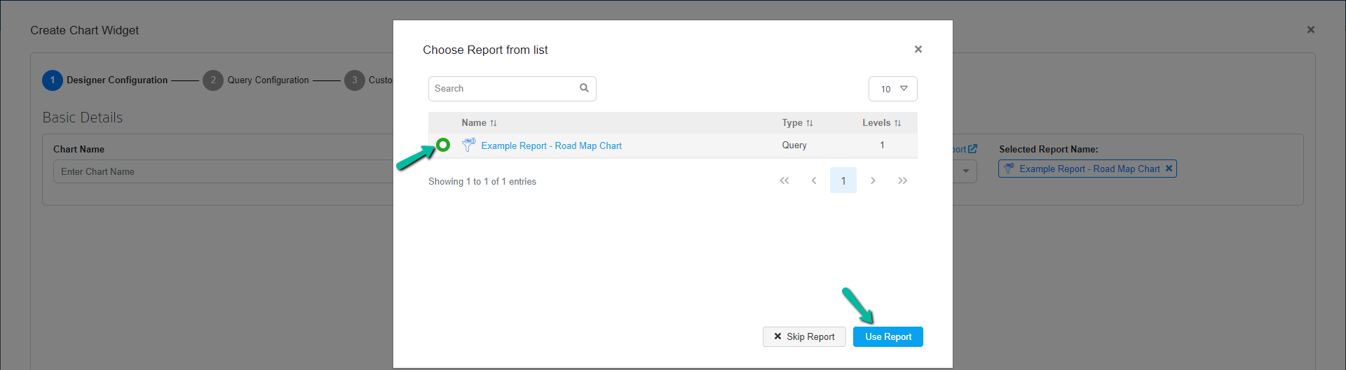
From Prolaborate V4.2.0 and above, charts can be created by using predefined and reusable reports from Report Configuration. To know more about Report Configuration, click here
The created reports from report configuration window can be applied when creating a new chart widget. After choosing the widget type, a popup will appear listing all the available reports.
For EA chart widget, it will display only the query type reports. The level column denotes the number of levels configured in the report.
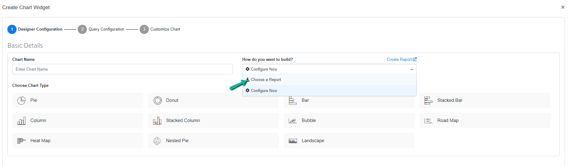
Report can also be selected by selecting Choose a Report from the dropdown How do you want to build? option.
After selecting the report, choose the required chart type. The configuration will be automatically applied and then click Next to navigate to the chart settings page.
Users can customize the style and aesthetics of the chart on the Chart Settings page. We’ll go over each feature in more detail later in this article. Now press the Save button.
Customize Roadmap Chart
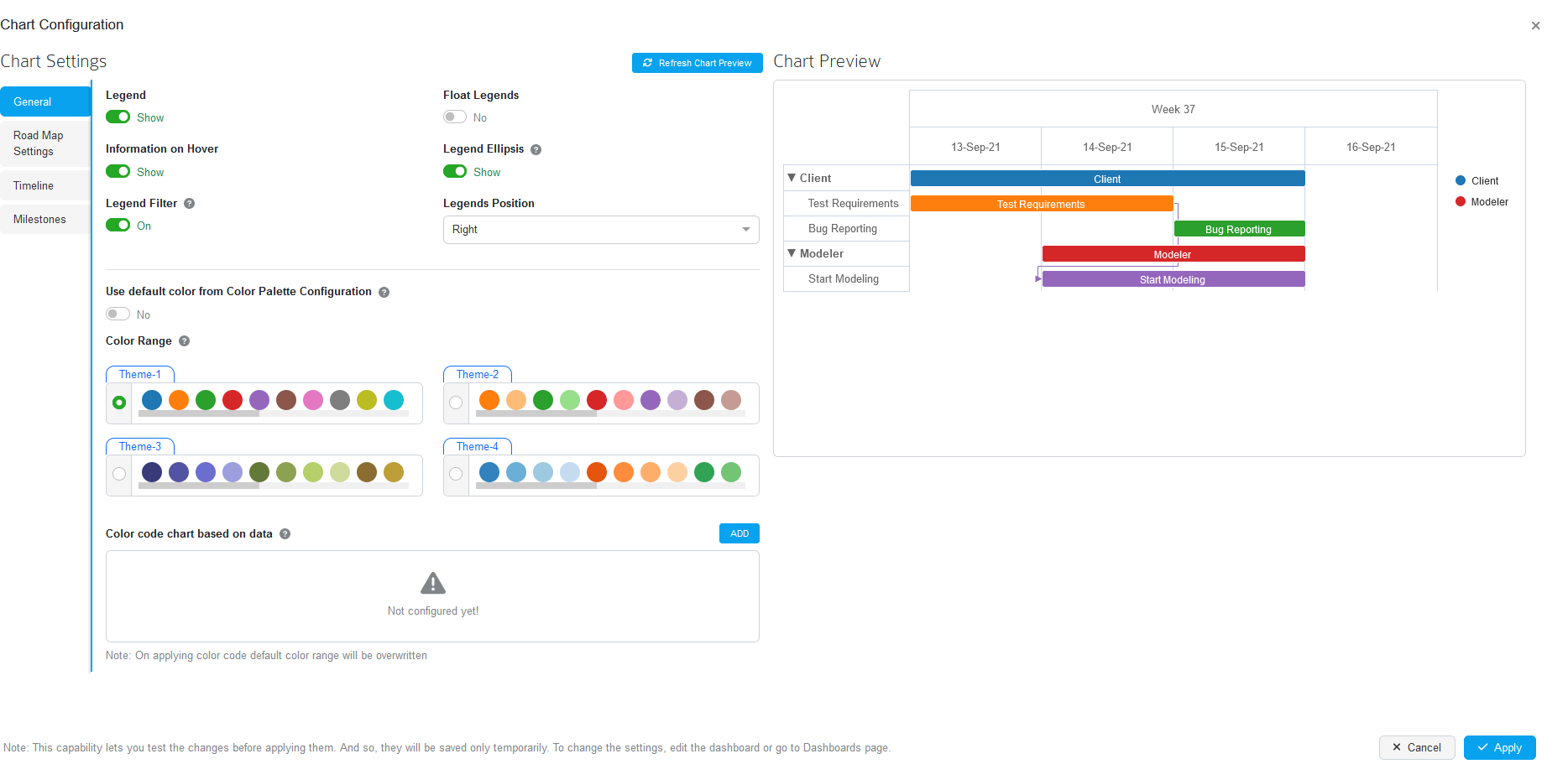
Chart Preview: This section will show a preview of the chart after the changes have been applied to it.
Refresh Chart Preview: This feature allows you to see a preview of the changes made in the chart settings on the current page. Changes made in the chart settings will be reflected in Chart Preview.
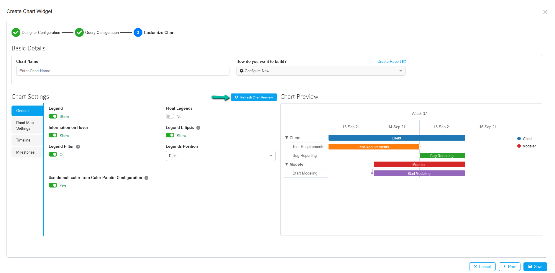
Customize Legend
Legends for Roadmap charts is introduced in Prolaborate version 4.4.1. Users can modify the functionalities related to legend in General under chart settings page
| Field | Description |
|---|---|
| Legend | Toggling this option will allow the users to show or hide the legend in the chart |
| Float Legend | Enabling this option will display the legend within a box |
| Legend Ellipsis | Long Legend will be displayed only to the extent permitted. Enabling this feature allows the user to see the entire legend when one hovers over it |
| Legend Filter | Enabling this option allows users to filter the roadmap items via legends
|
| Legend Position | Allows users to position the legends on right or bottom |
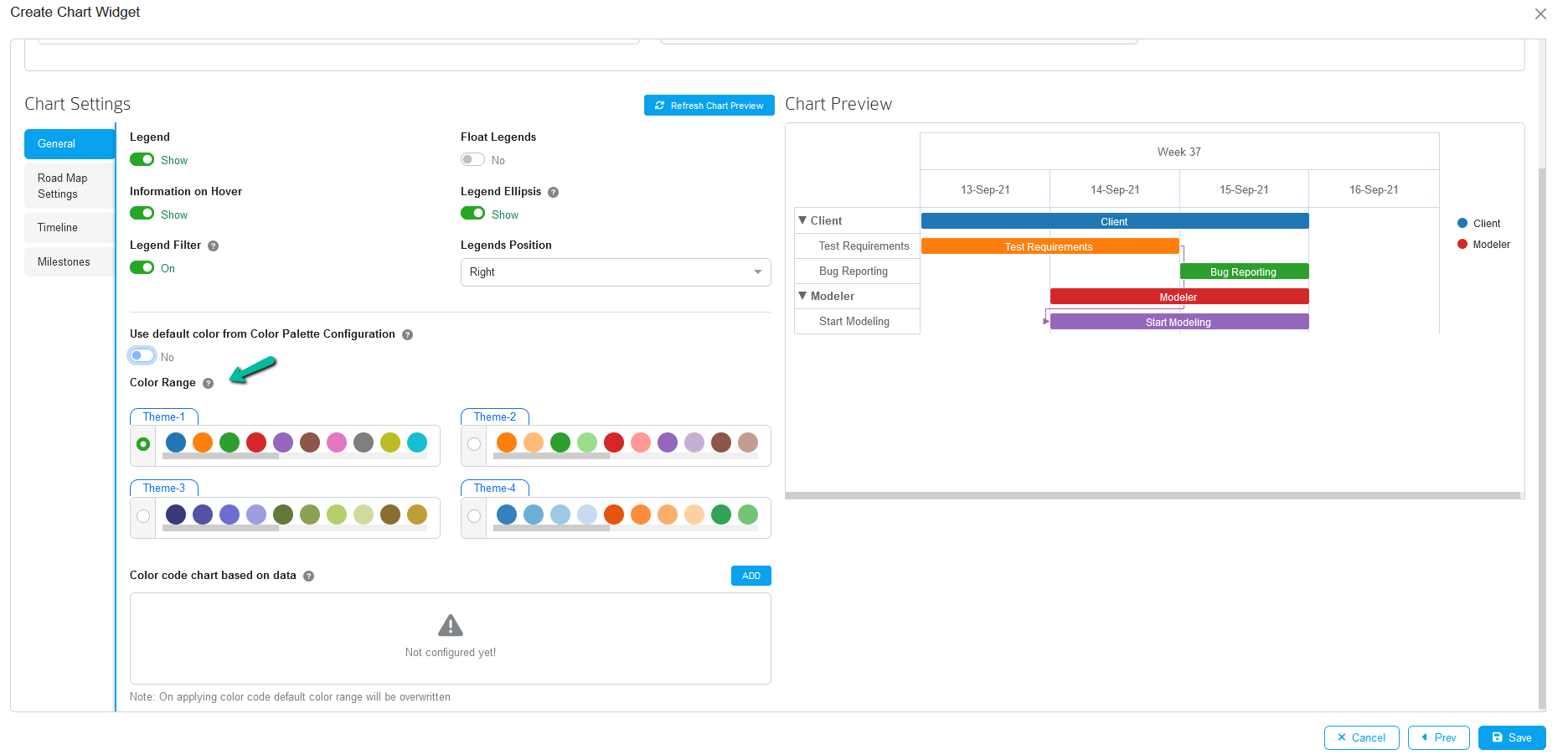
Customize Bar Colors
Modify the color of the roadmap bars users can utilize these settings and change the required colors to the item bars from the chart.

| Field | Description |
|---|---|
| Information on Hover | Enabling this option will display the information when hovering the artifact |
| Use default color from Color Palette Configuration | This option will be enabled by default where colors will be applied to the chart either from Color Palette or MDG Color Configuration |
| Color Range | With this feature, users can select any of the predefined color range for their chart |
| Color code chart based on data | With this feature, users can define a customized color code for a specific section of the roadmap chart. To use these settings, enter the legend exactly “as is” in the text box where you want to define a customised color code and choose a color to add. You can also specify different color codes for different legends. |
Note:
- Disable Use default color from Color Palette Configuration option to show both Color Range and Color code chart based on data options
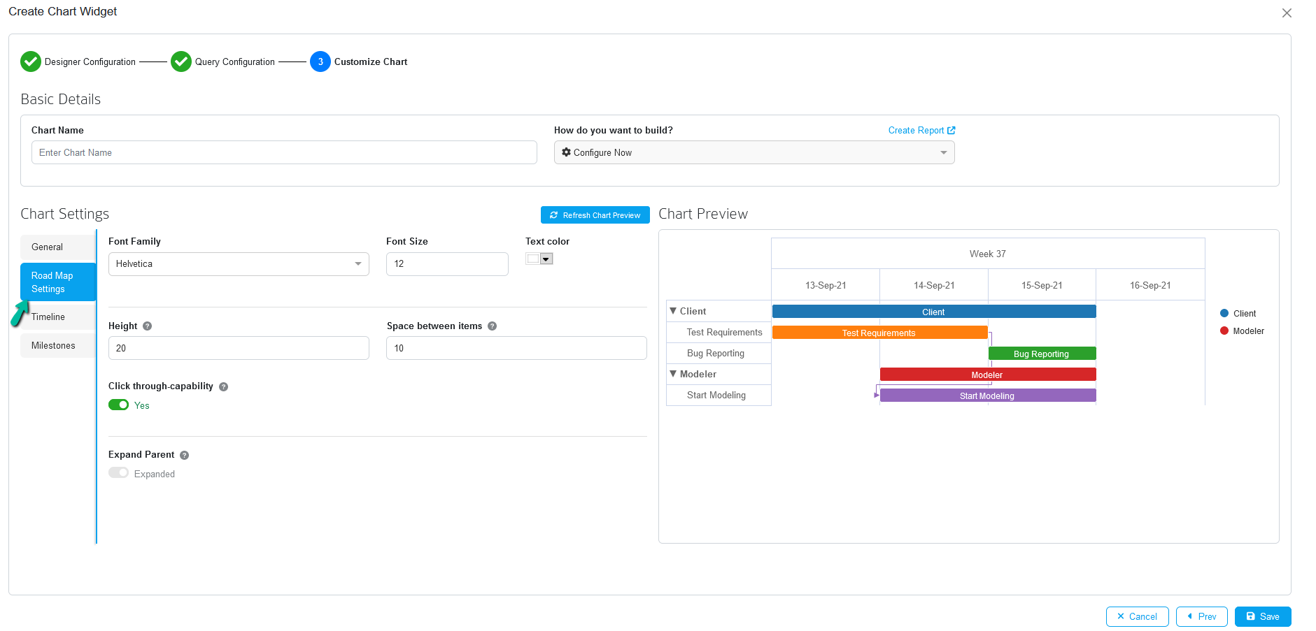
Customize Fonts
Roadmap settings allow you to change the height, space between items, font type, font size, font color etc. Under Chart Settings, you can select Roadmap Settings
| Field | Description |
|---|---|
| Font Family | Select the font to be applied for the chart’s text and numbers. Select the desired font for the text and numbers by clicking the dropdown |
| Font Size | Specify the font size that will be used for the chart’s text and numbers. Select the desired font size for the text and numbers by clicking the dropdown. |
| Text Color | Select the font color that will be used for the chart’s text and numbers. Click the dropdown and select a color from the color palette to apply to the text and numbers. |
| Height | By changine the value in this field user can customize the Height of the bar |
| Space between Items | By changing the value in this field user can adjust the space between two items |
| Click through-capability | If enabled, clicking on a roadmap item opens the properties window |
| Expand Parent | Expand or collapse all roadmap items when opening the chart
|
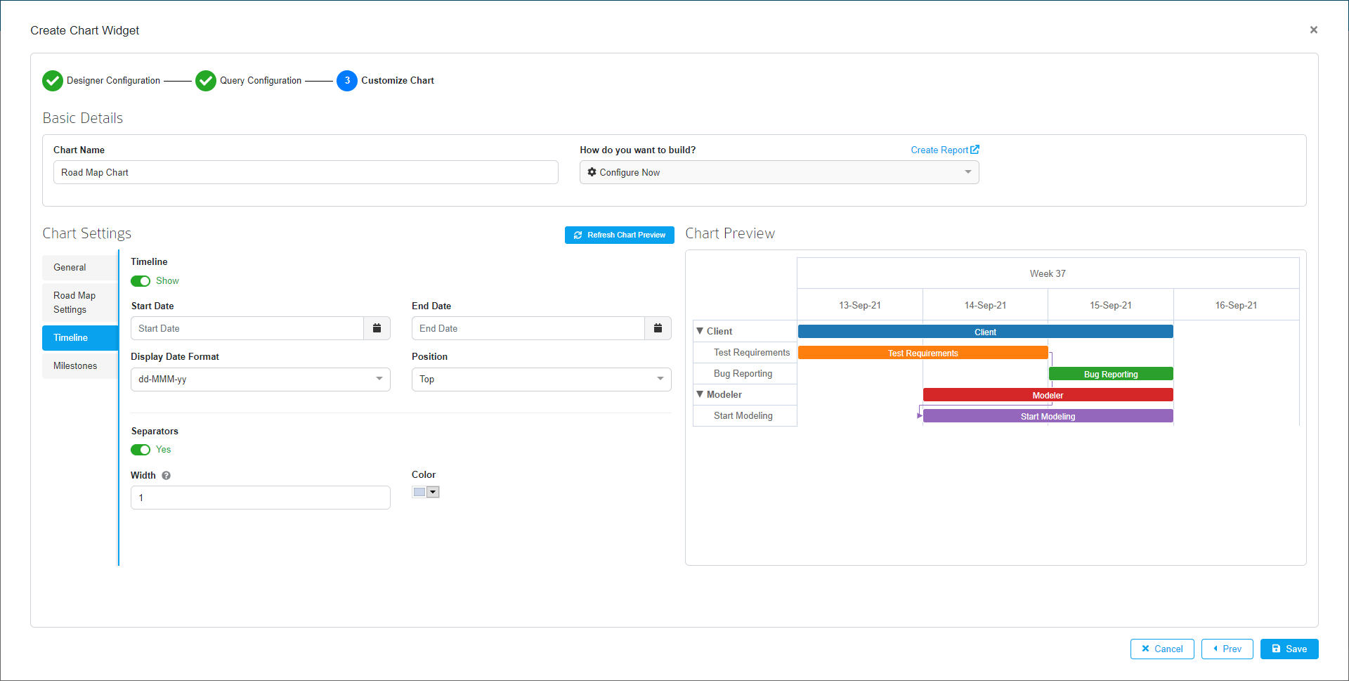
Show Timeline
Timeline let you manage start date and end date, and their date formats, position etc.
| Field | Description |
|---|---|
| Timeline | Toggle this option to show/hide the dates in the chart |
| Start date | Choose required start date to show case your items in roadmap |
| End date | Choose required end date to show case your items in roadmap |
| Display Date format | Choose required date format to be displayed in the chart |
| Position | Specify the position of the date in the chart |
| Seperators | Toggle this option to show/hide separators in the chart |
| Width | By changing the value from this field user can able to increase the thickness of the separator line |
| Color | Specify the color to be applied to the separator line |
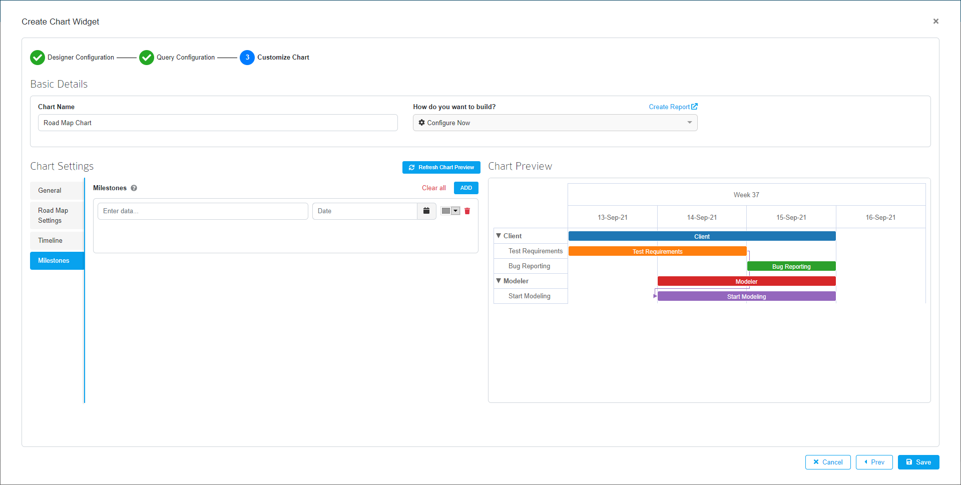
Add Milestone
Milestone let you create a Milestones for the Roadmap with Label and specific date and color. Click Save to save all the configurations.
After clicking save, users can change the size of the widget on the following page by clicking on the bottom right corner of the widget. After resizing the widget’s size, click Save.
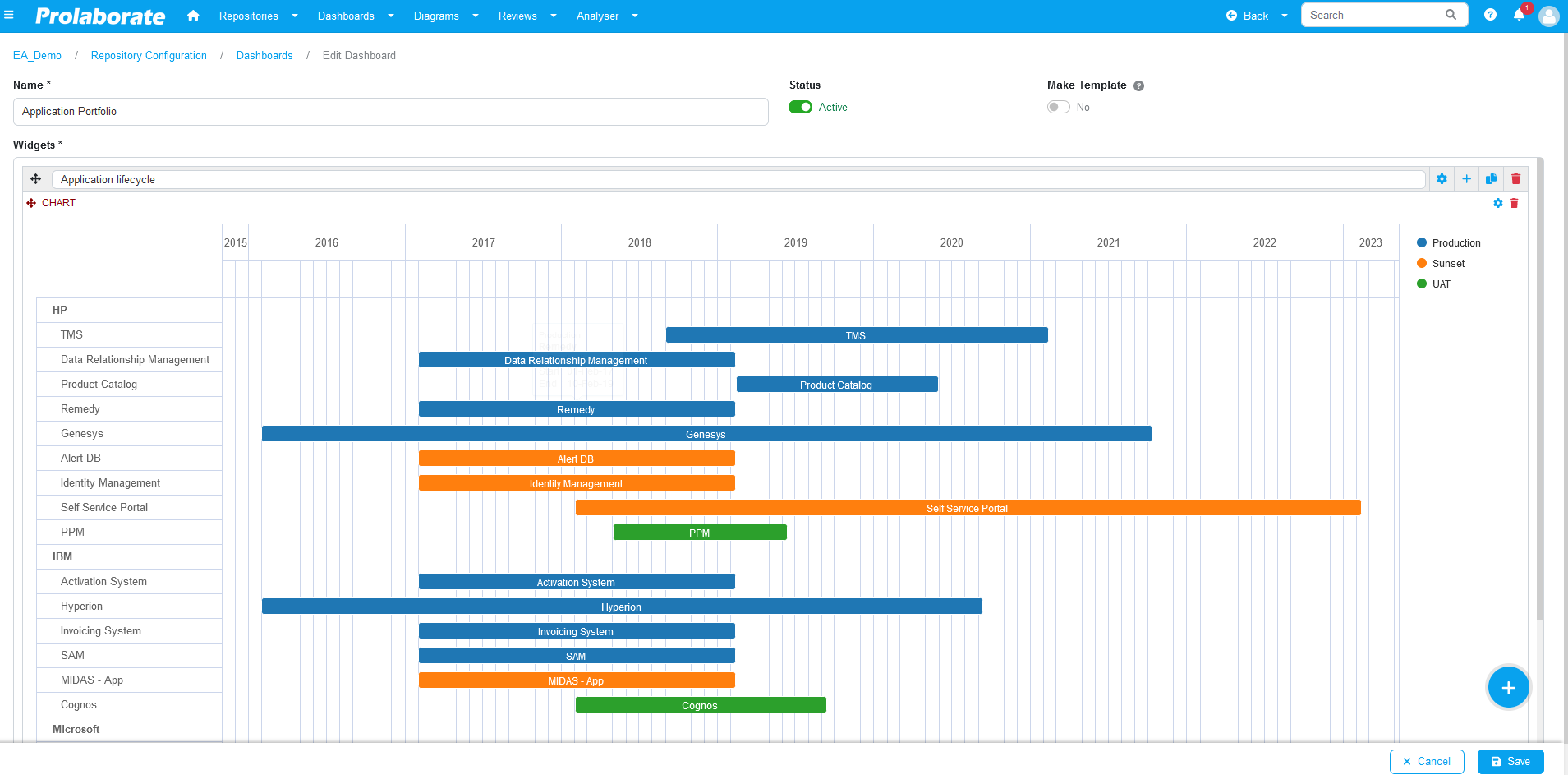
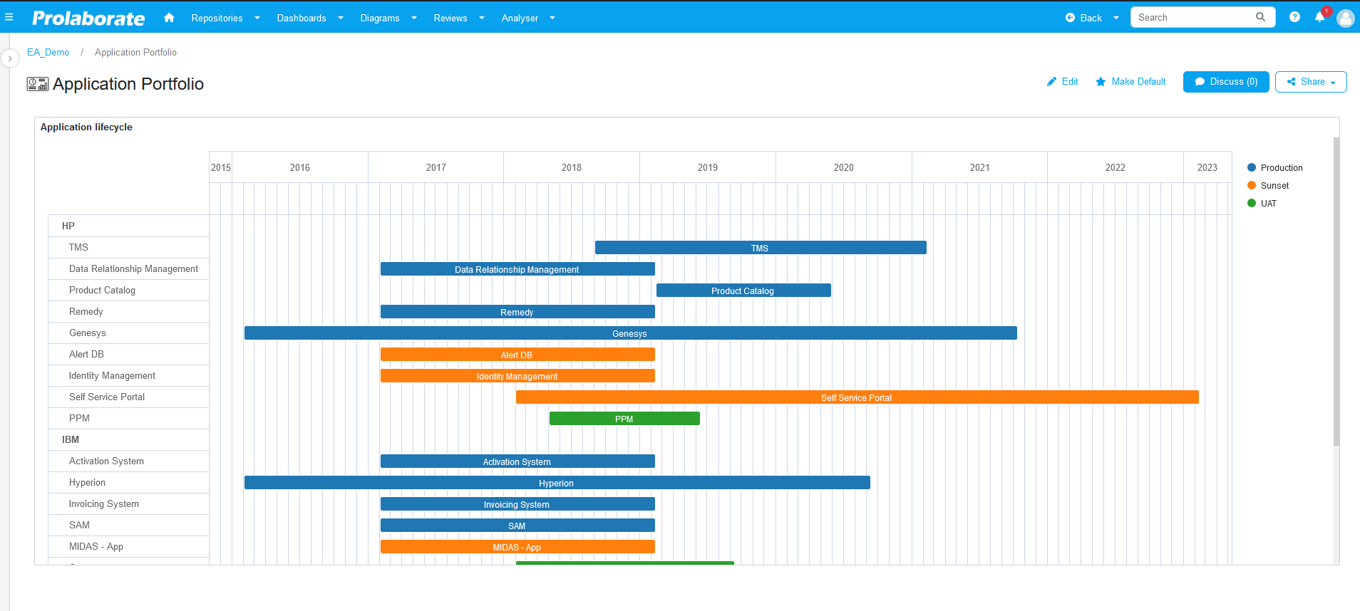
The Roadmap chart has been successfully configured and is now visible on the dashboards page.
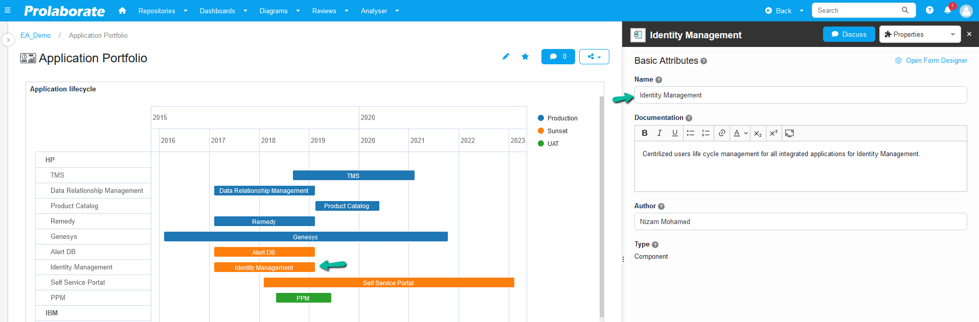
Information of the roadmap Items
By simply clicking the artifact from the roadmap chart those artifact details shown in the property window.
Road Map Chart Widget Options
Once the chart widget is created, multiple options will be displayed when hovering on it.
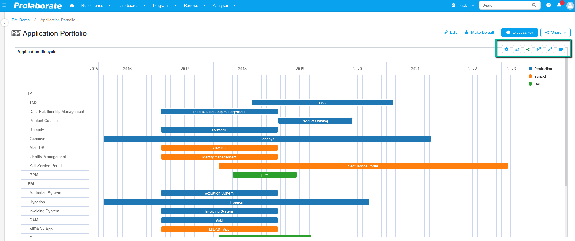
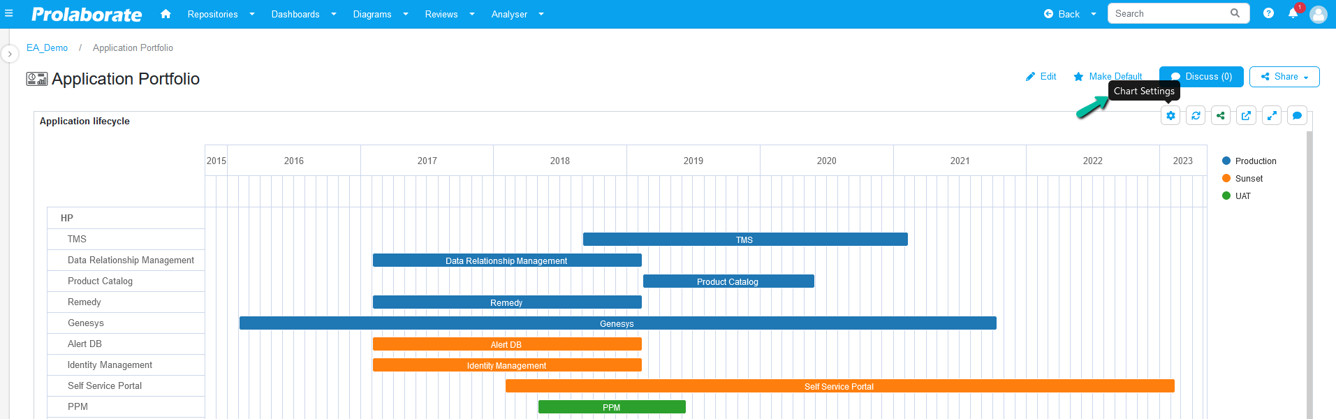
Chart Settings
Chart Settings in the widget displays a list of option where users can temporarily modify the look of the chart,etc.
Modify View
Modify view option opens the chart settings popup window where users can modify the look and aesthetics of the chart temporarily. This helps users to test the various changes before applying them permanently.
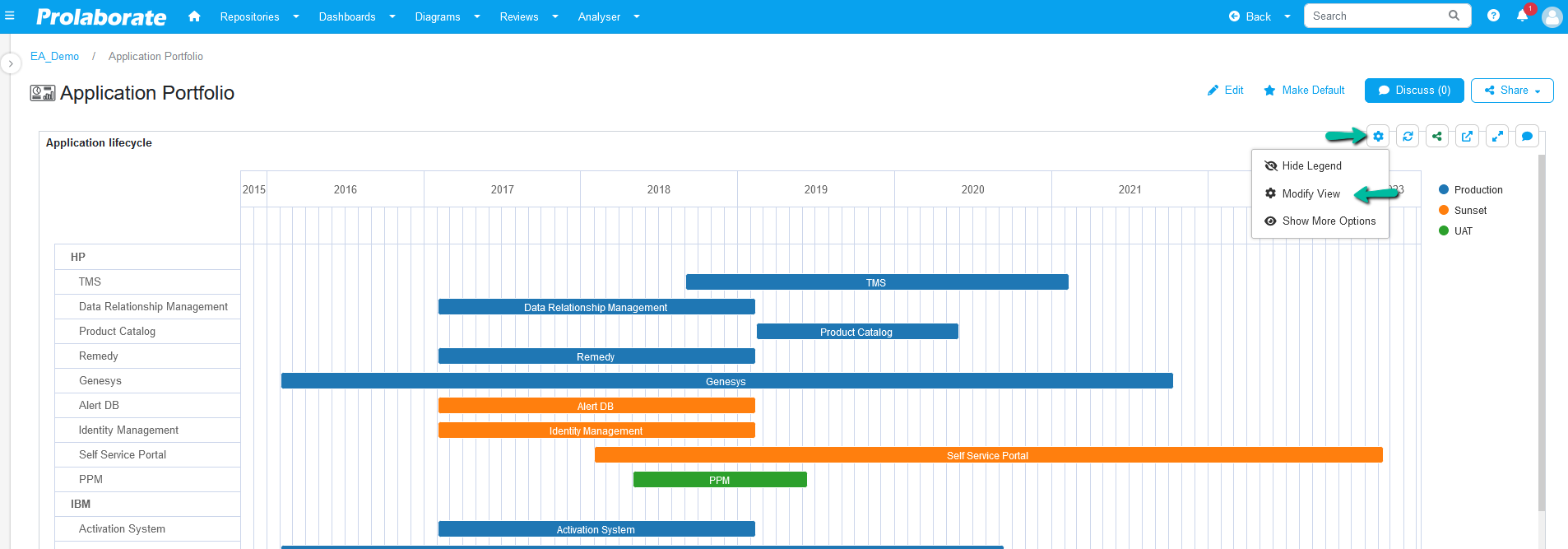
Expand/Collapse All
Expand or collapse the contents in the grouping using these options temporarily.
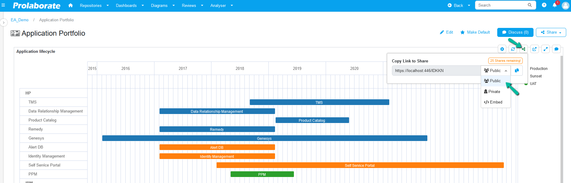
Share Widget
To share a widget, hover over a widget and click on the Share icon in the widget. Under the Copy Link to Share dropdown, select the type of link (Public, Private or Embed) to be shared.
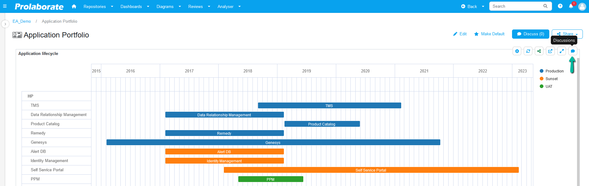
Discuss Widget
Discussions can be initiated for a selected widget in the dashboard. To discuss, hover over a widget and click the Discuss icon to open the discussion tab to start a discussion.
The other options in the widget includes refresh, view and maximize or minimize the widget respectively.