
Analysing Impact and Performing ‘what-if’ analysis using Analyzer
Feature Spotlight: Analyzer
As we know the model information gets larger every day, it would be hard to remember and locate each artifact information. It so happens that the favourite diagrams are not often revisited after the initial creation and they eventually become irrelevant. Hence, for the users who like to visualize & analyze the current state of architecture must use ‘Analyzer’, the feature which allows us to overcome this challenge. Analyzer brings in the capability of creating views to analyze the impact of change in Prolaborate.


Note:
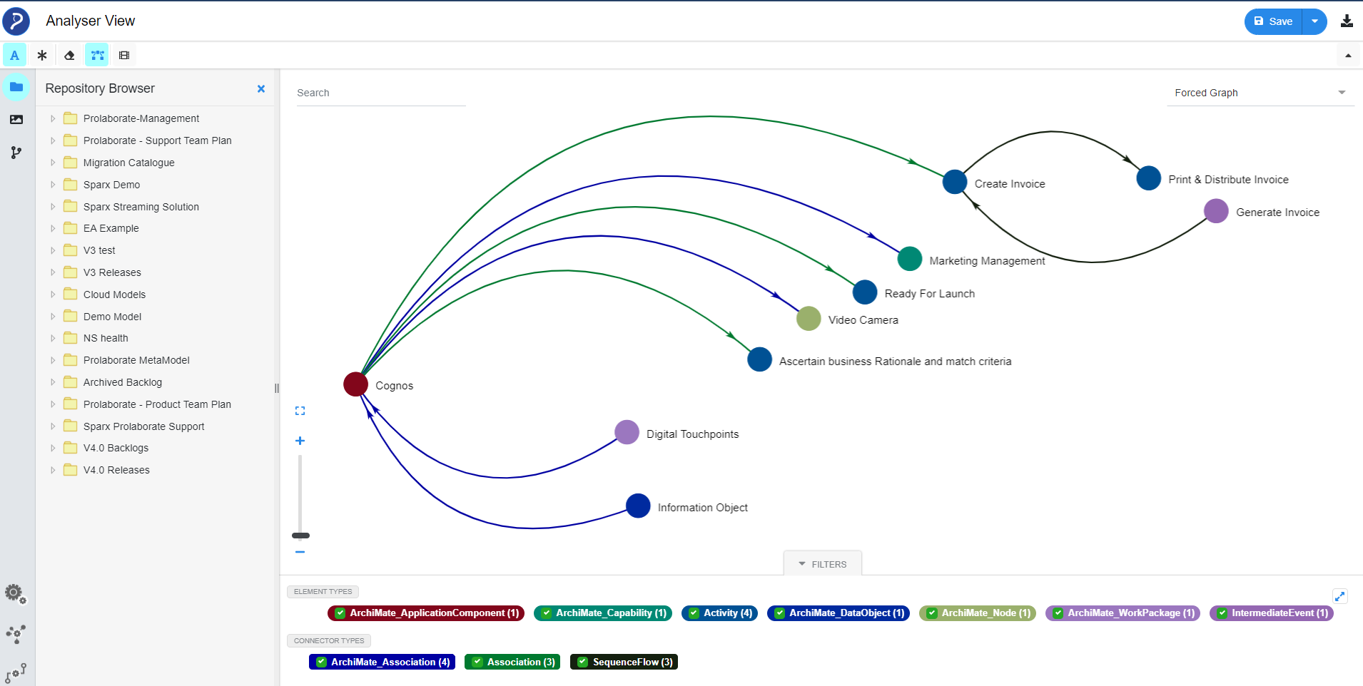
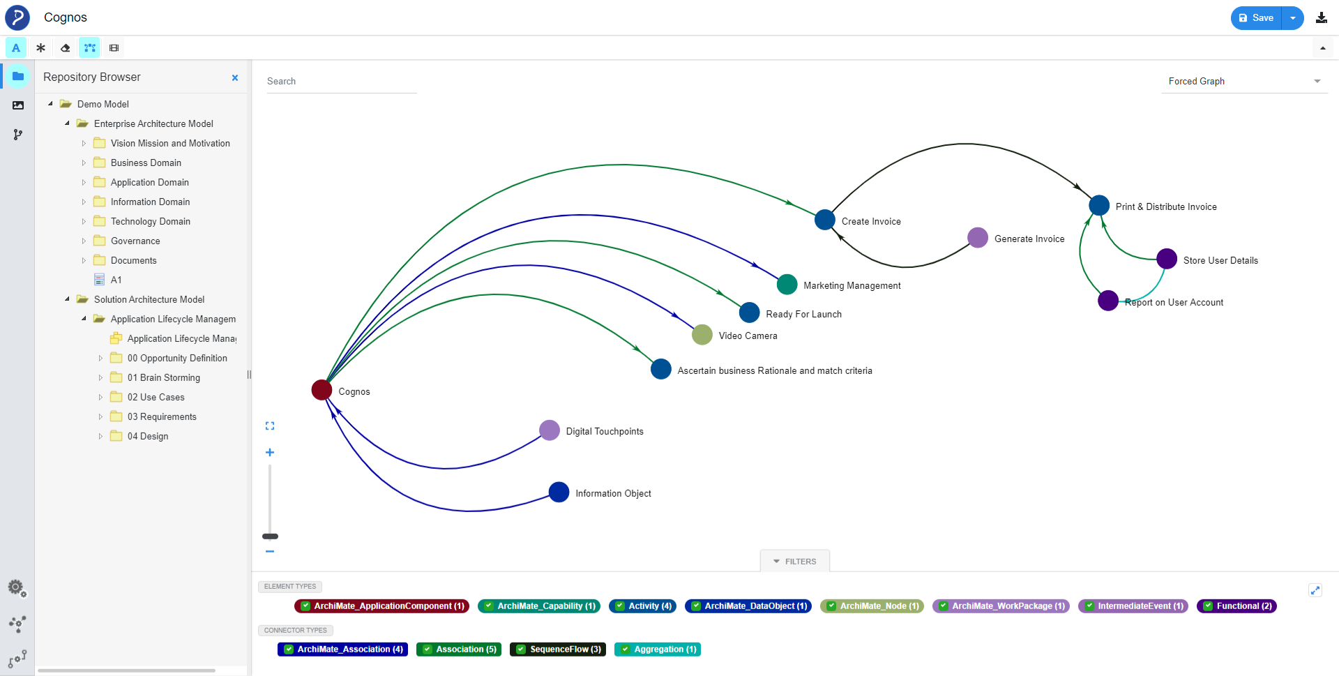
- In the above image each bubble represents an artifact, and the arc line represents the connection between artifacts. The page classifies “Element Types” and “Connector Types” used by artifacts on view.
Few Benefits of Analyzer
- Perform Impact Analysis in no time on any EA diagram
- Build Holistic View around an artifact to understand the Impact
- Bring nth level artifact to view without much juggling between pages
- Enable teams to take better decisions using Enterprise Architect Data
- Slice and Dice EA Model Data
Few Features of Analyzer
- Show or Hide Connectors and Artifacts on View
- Convert any existing EA diagram to Analysis View
- Design the Views as per your Organization’s Theme
- Easy navigation to the Properties and Overview page
- Download Analyzer view as Image
- Create view and insert elements
Let us understand how to use Analyzer with an example
A user who is unfamiliar with a specific model and keen to understand the impact of certain application on his enterprise model can use ‘Analyzer’ to visualize easily.
In this article we have covered a simple use case, where a user can visualize relationships up to three levels for an element.
We have a large model with many artifacts. In Top-level we have “Cognos” Application Component and “Report on User Account” connected in the 3rd level.
Let us see how we can achieve this.
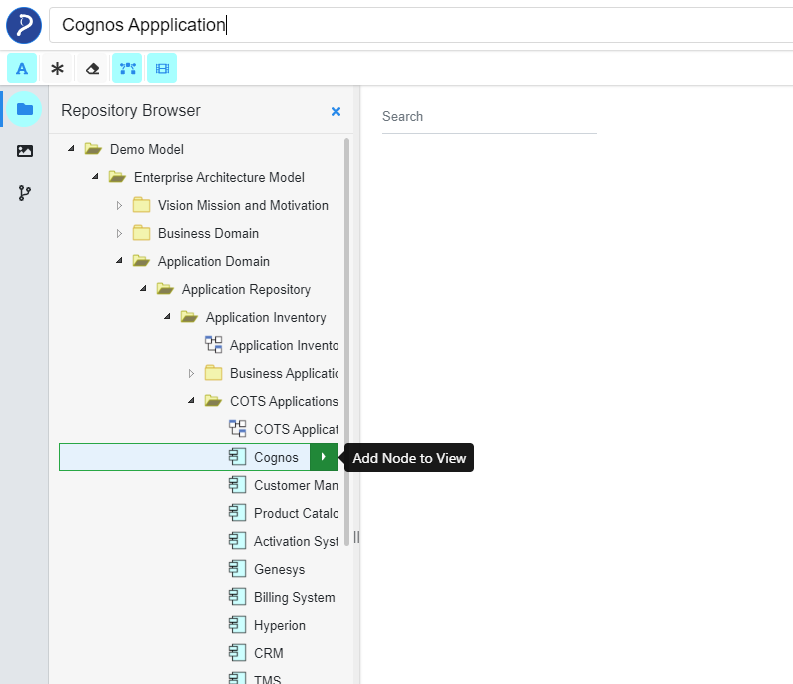
Step1: Please select Node from “Repository Browser”
Step2: Click the node once it is available in View
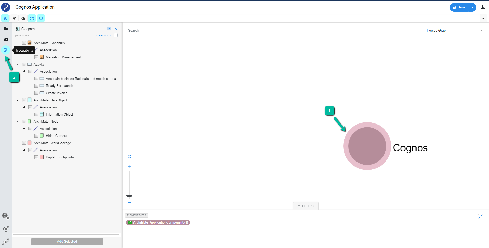
This helps the user get the related elements list under traceability menu
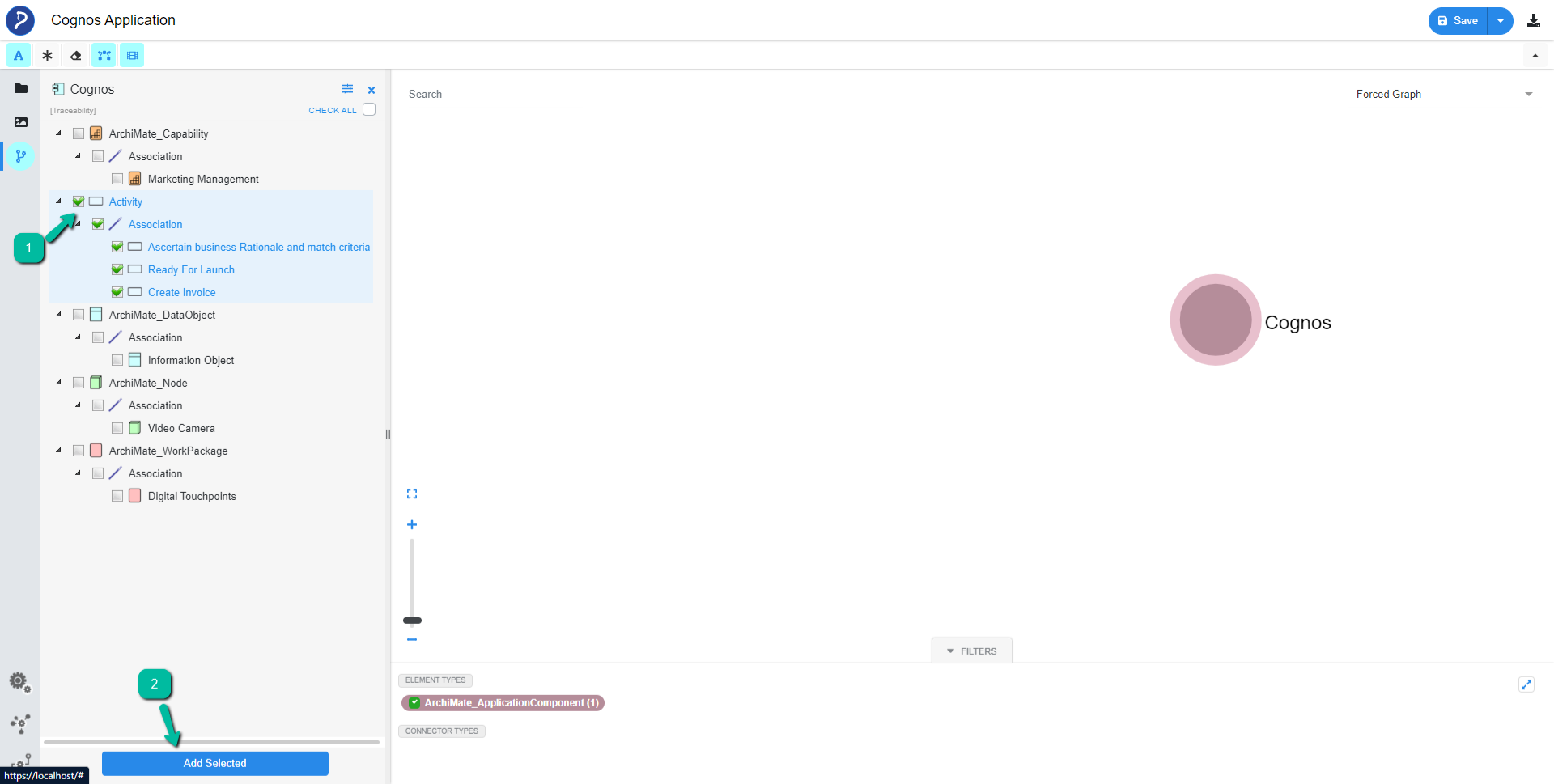
Step3: Choose the next level of connected elements from the list and click “Add Selected” from the Repository browser.
Step4: Click the Second level of Node from ‘View‘ to get the Connected elements list.
Repeat the above-mentioned steps to get the complete relationship View of the element up to the levels required.
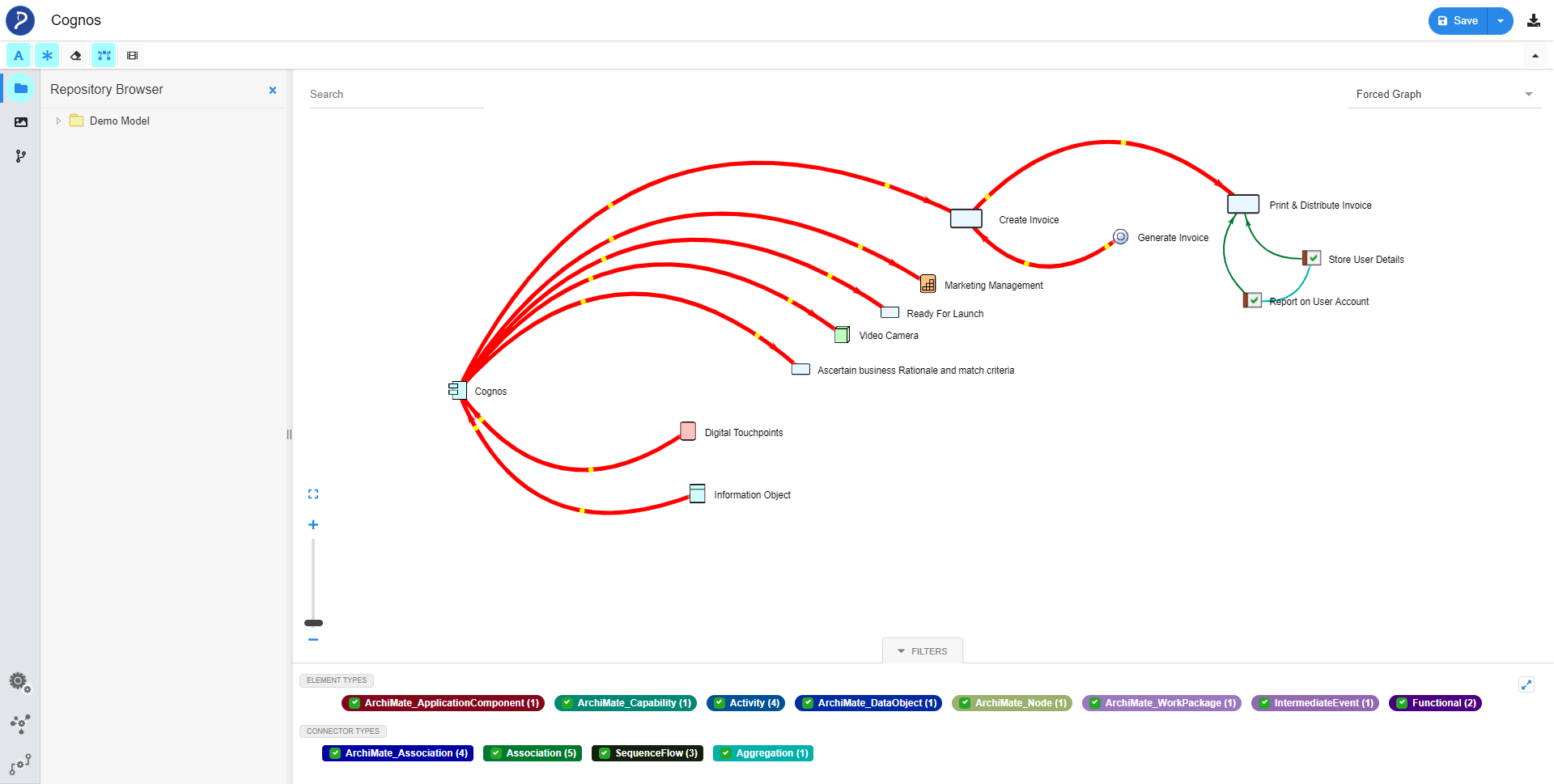
Highlighting Path
By enabling this option, users can see the highlighted flow between artifacts and its direction.
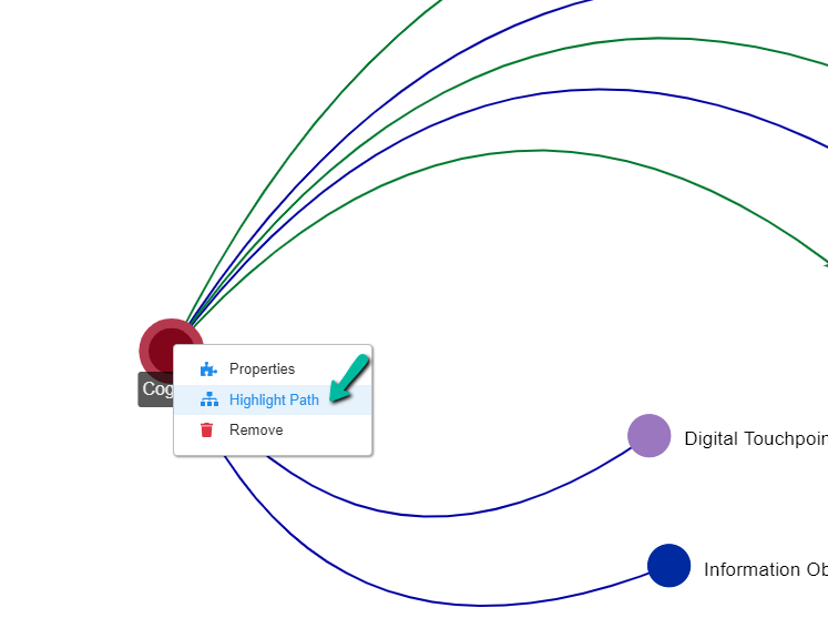
Users can remove nodes to analyze the impact of change in the view.
To learn more about Analyzer functionality click here.
Lets have a quick look about Analyzer through this video