Build Enterprise Roadmaps
Prolaborate provides a powerful yet intuitive tool to build Enterprise Roadmaps based on Enterprise Architecture data in minutes.
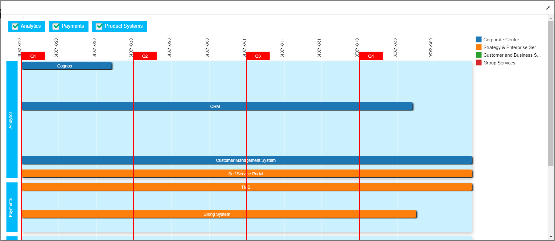
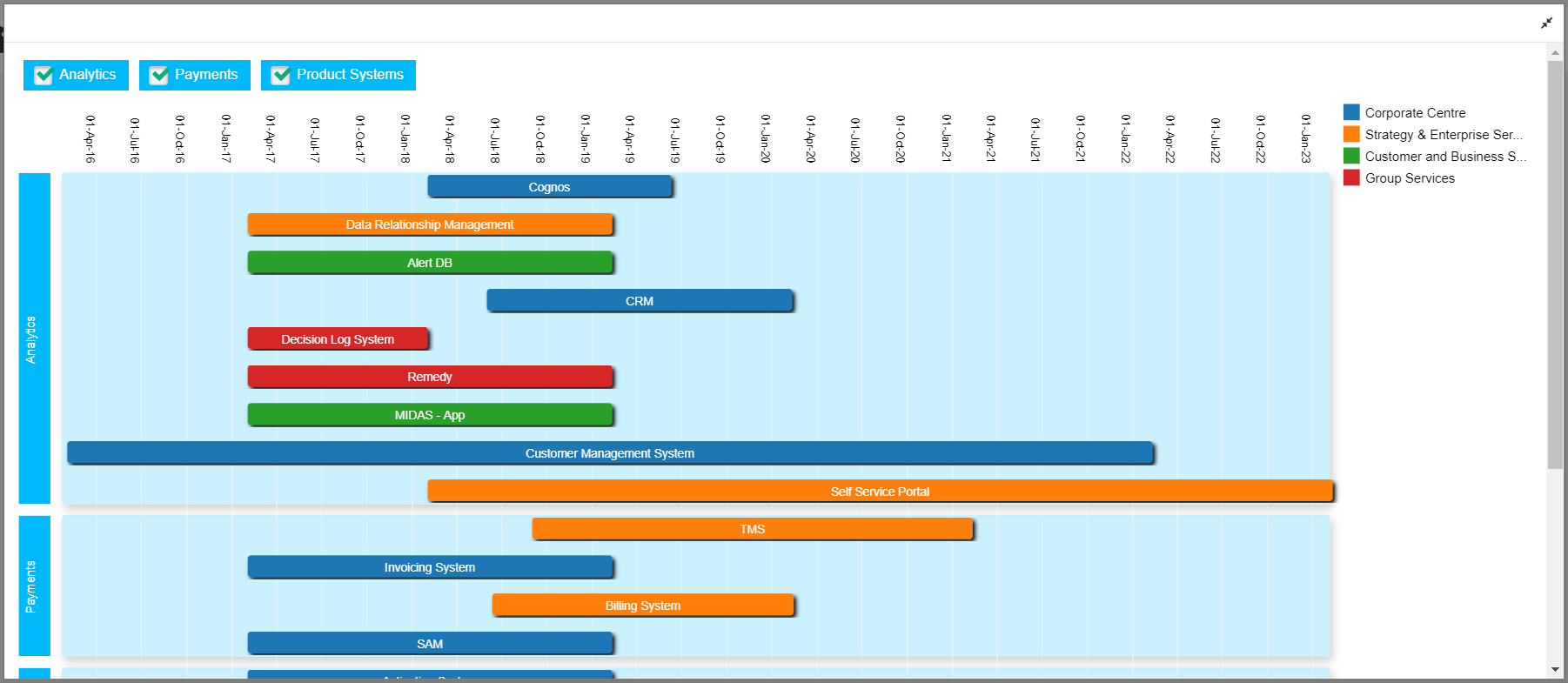
Here is an example of a powerful Enterprise Roadmap you can create:
The applications that are used in an organization has been placed in the chart based on their license duration for the next 5 years. Start of financial year have been marked to enhance readability.


We have also grouped the apps based on their Vendor (Legend on Top) and color coded based on their Business Unit (Legend on the right).
Note we will be looking only at the capabilities of chart widgets in this guide-; please refer to Dashboard Designer to learn about the general functionalities of the dashboard.
Build using Chart Designer
To create a Chart, click on Menu > Dashboards. Click on Add New to create a new dashboard or edit icon to edit a dashboard.
Click on Add Widget or Add icon on the bottom right to see the list of widgets. Click on EA Chart and then on Add New Widget.
Select Roadmap and click on Designer.
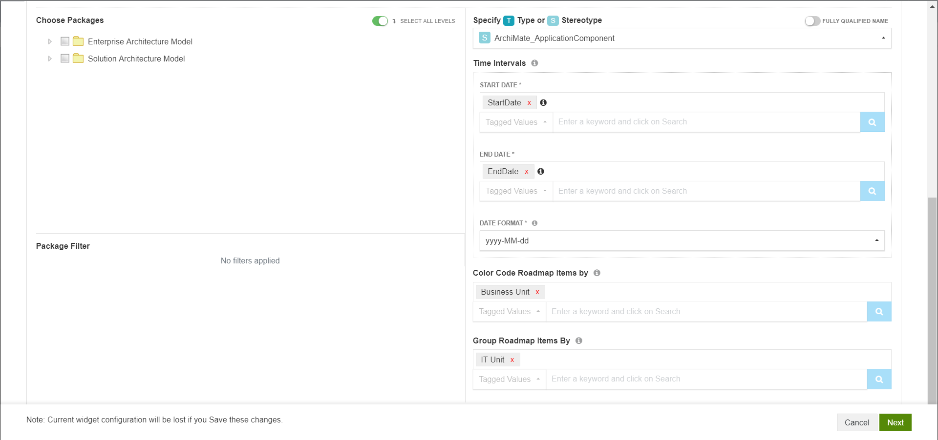
Follow these steps to create a roadmap chart:
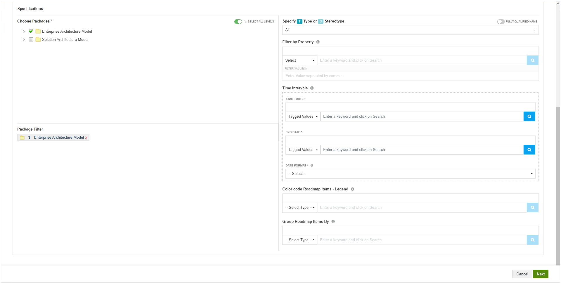
- Choose the packages that contain the data for your chart i.e., the packages that has the EA objects which should be considered for the chart.
- Filters:
- Specify the Type or Stereotype of elements that should be considered for the chart
- Specify a Property. Elements only with the specified property will be considered for the chart
- You can even specify particular values for the selected property. For example, consider only applications with Status as Production
- Choose the date intervals based on which the Roadmap needs to be created through Start Date and End DateImportantly, specify the Date Format you have used to capture the dates in EA. To help you, value stored in your EA model will be shown to you as soon as you select a property in Start or End date.If the Date Format listed in the dropdown does not match with the format you use, choose Others and enter the date format that you use.
- Choose a basic property or tagged value to Color code Roadmap items.
- And if you want to Group the road map items, specify the property or tagged value based on which they should be grouped. Groups and elements in the roadmap will be sorted on an alphabetical order.
Sample Configuration and Result
Configuration:
Result:
Build using SQL Queries
When you are building advanced charts using SQL queries, Chart query is used to build the charts and Result query is used to show in-depth information on click.
Choose the date intervals based on which the Roadmap needs to be created through Starttime and endtime aliases. Importantly, convert the date format to dd-mm-yyyy.
Choose a basic property or tagged value to display on the roadmap paths by defining alias displayname.
And if you want to group the road map paths, specify the property or tagged value based on which they should be grouped using groupname alias.
To enable users to see in-depth information on click of a section of the chart, Aliases in Chart query need to be used in Result Query.
For example, if chart query is
select object_type as series from t_object
the respective result query will be
select name, object_type, stereotype where object_type = ‘’
Additionally, you can use the following aliases in Result query:
a. Add alias “classguid” to the GUID – to see details of an item on click, For example:
select name,ea_guid as classguid from t_object where object_type = ‘’
b. Add aliases – Base Type and Stereotype to Type and Stereotype respectivelyto see appropriate EA icons, For example:
select name, object_type as basetype, stereotype as stereotype from t_object where object_type = ‘’ and stereotype= ‘’
c. Prefix an alias with “hide_” to not see a column even when used in the query. For example, the following query will give the same result as above, but Base Type and Stereotype columns will not be shown in the result:
select name, object_type as hide_basetype, stereotype as hide_stereotype from t_object where object_type = ‘’ and stereotype= ‘’
Note:
- Aliases should not contain any space.
Sample Query and Result
Chart Query:
select distinct o.Object_ID as objectid, o.Name displayname, convert(varchar(30),cast(starttimetable.Value as datetime),105) as starttime , convert(varchar(30),cast(endtimetable.Value as datetime),105) as endtime , grouptable.Value as groupname, seriestable.Value as series from t_object o Join t_objectproperties starttimetable on starttimetable.Object_ID=o.Object_ID Join t_objectproperties endtimetable on endtimetable.Object_ID=o.Object_ID Join t_objectproperties grouptable on grouptable.Object_ID=o.Object_ID Join t_objectproperties seriestable on seriestable.Object_ID=o.Object_ID where starttimetable.Property='StartDate' and endtimetable.Property='EndDate' and grouptable.Property='Vendor' and seriestable.Property='Health Indicator' and o.stereotype IN ('ArchiMate_ApplicationComponent') and o.Package_ID in (select p.Package_ID from t_package p where p.ea_guid = '{B97FDE07-3860-4990-9AAA-30F951327455}')
Chart Shown in Dashboard:
The result is same as shown above.
Customization Options
The following settings are available:
- General
- Color code Roadmap items – You can disable the legend for Color coded items. Change the options and check how they work by clicking on See Chart Preview.
- Information on Hover – Disable to hide the information that shows up on hovering over Roadmap items
- Color Range – Pick the color range that needs to be used while displaying the chart
- Color Roadmap items based on their Name – Use this setting if you want to specify a particular color based on the data that will be showed in the dashboardFor example, as per the configuration in the screenshot, the piece of pie which has “Data Management System” as the data will show up in red color in dashboard
- Roadmap Settings
- Text Color and Font Family – Specify the color and font family of labels of Roadmap items
- Height – Adjust the height of roadmap items using this setting
- Space between items – Modify the space between the roadmap items
- Click-through-capability – When enabled, users will be able to click on Roadmap items to go to their Overview pages to see more information
- Group Legend – Use this setting to hide the Group legend shown above the chart
- Group Background Color – Specify the background color for group legend
- Specify Group background color based on Group name – As the name suggests, use this setting to highlight certain groups by a specific color
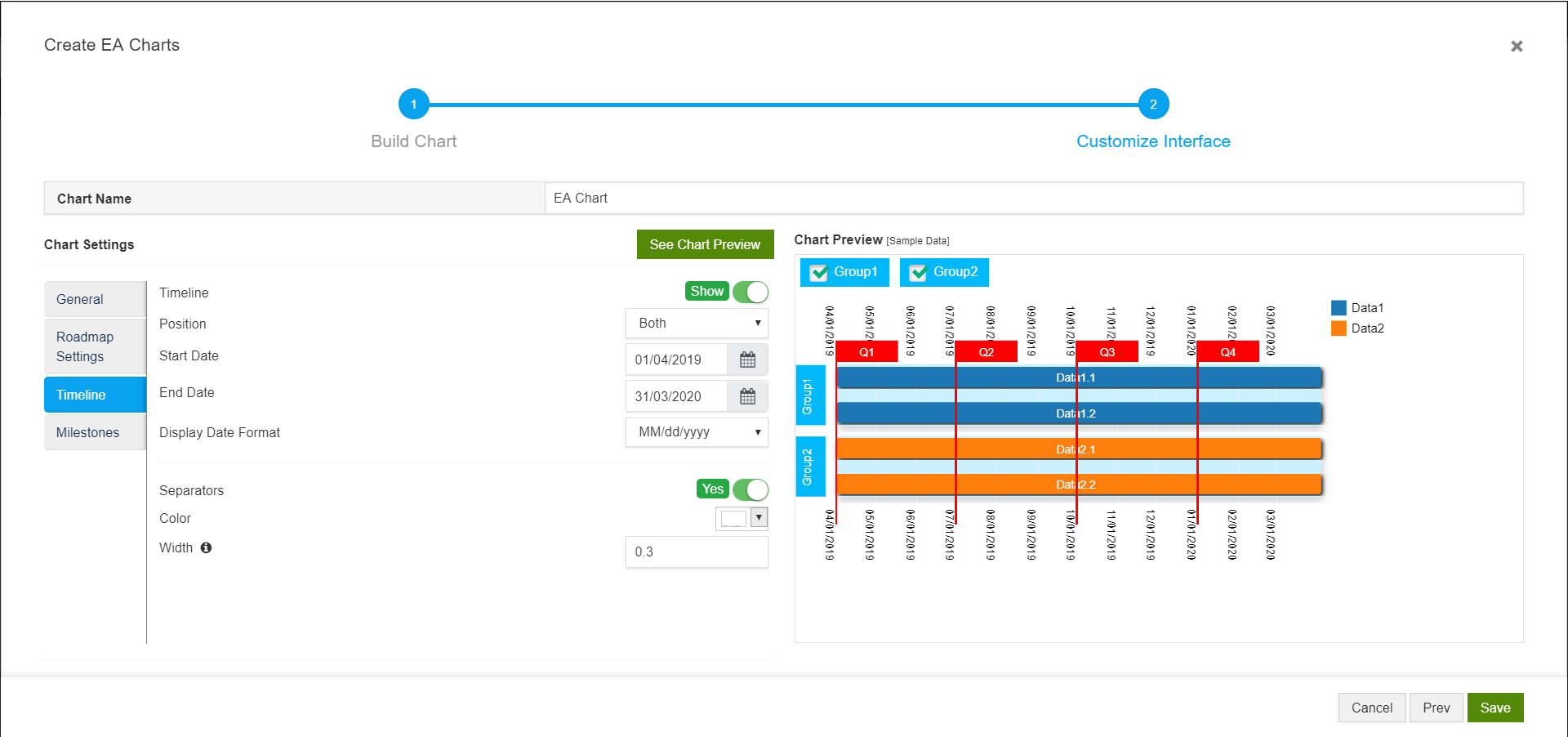
- Timeline
- Timeline – Hide the dates shown in the chart using this setting
- Position – Specify where you want to see the dates – at the top or bottom or both sides
- Start and End Date – Use this setting to focus only on a specific duration
- Display Date Format – Specify a date format that your users are comfortable with
- Separators – Hide the seperators if you don’t want to see them
- Color and Width – Specify the color and width of the seperators
4. Milestones
This is an important setting to enhance the information conveyed through this chart. You can specify the milestones of your roadmap through these settings.
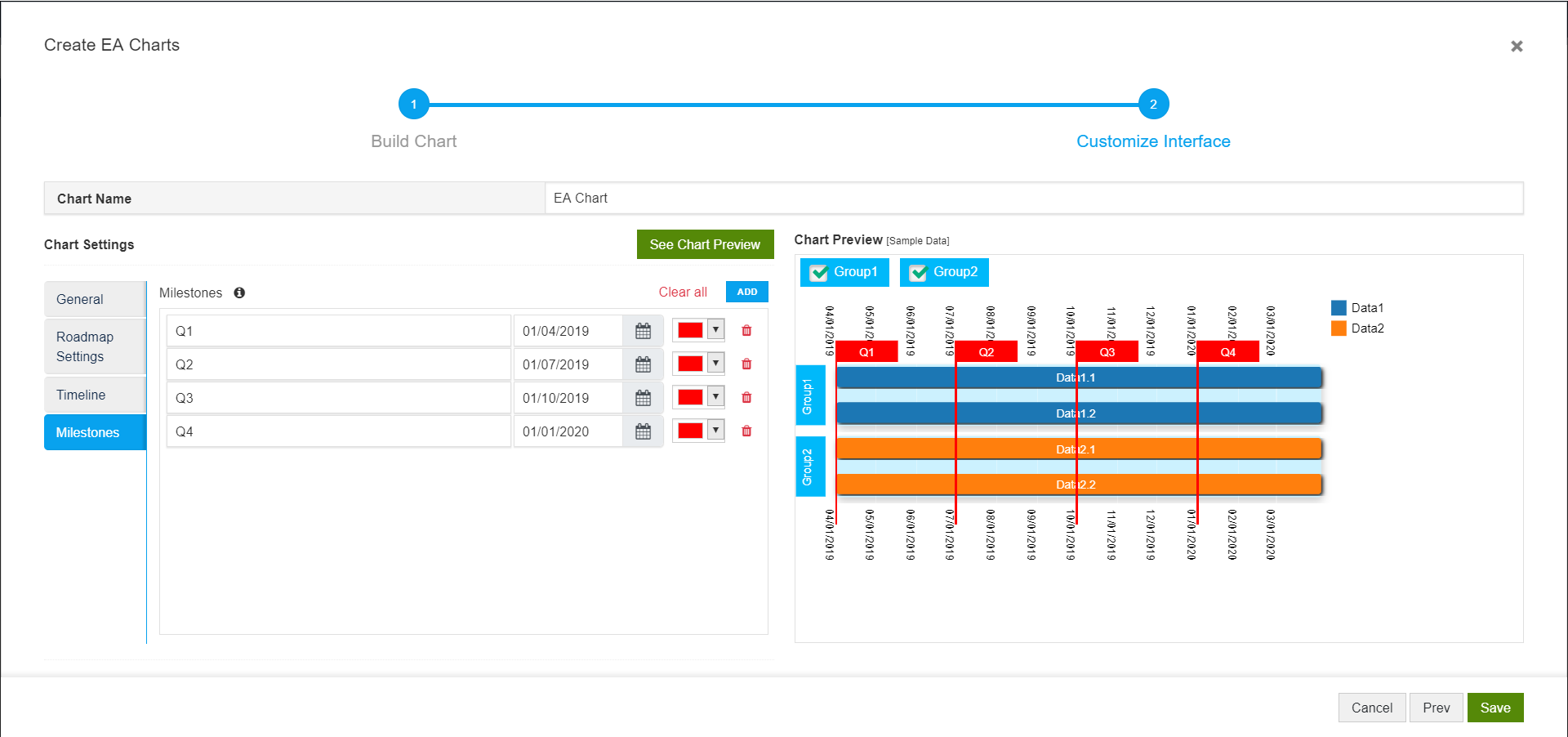
Here is how the chart looks after applying the above settings: