Build Pie Charts
Build Pie Charts
Prolaborate provides a powerful yet intuitive tool to build Pie charts based on Enterprise Architecture data in minutes.
Note we will be looking only at the capabilities of chart widgets in this guide-; please refer to Dashboard Designer to learn about the general functionalities of the dashboard.
Build using Chart Designer
To create a Chart, click on Menu > Dashboards. Click on Add New to create a new dashboard or edit icon to edit a dashboard.
Click on Add Widget or Add icon on the bottom right to see the list of widgets. Click on EA Chart and then on Add New Widget.
Select Pie and click on Designer.
Follow these steps to create a pie chart:
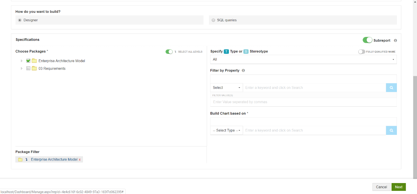


- Choose the packages that contain the data for your chart i.e., the packages that has the EA objects which should be considered for the chart.
- Filters:
- Specify the Type or Stereotype of elements that should be considered for the chart
- Specify a Property. Elements only with the specified property will be considered for the chart
- You can even specify particular values for the selected property. For example, consider only applications with Status as Production
- Choose the property based on which the chart under Build Chart based on. It can be any basic property or tagged value.
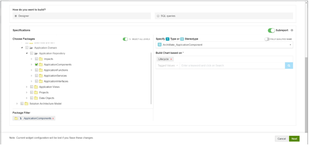
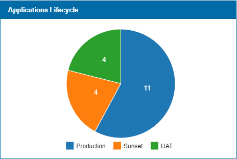
Sample Configuration and Result
Configuration:
Result:
Build using SQL Queries
When you are building advanced charts using SQL queries, Chart query is used to build the charts and Result query is used to show in-depth information on click.
Pie chart will be created based on the property you define as “Series”.
For example,
select object_type as series from t_object
To enable users to see in-depth information on click of a section of the chart, Aliases in Chart query need to be used in Result Query.
For example, if chart query is
select object_type as series from t_object
the respective result query will be
select name, object_type, stereotype where object_type = ‘’
Additionally, you can use the following aliases in Result query:
a. Add alias “classguid” to the GUID – to see details of an item on click, For example:
select name,ea_guid as classguid from t_object where object_type = ‘’
b. Add aliases – Base Type and Stereotype to Type and Stereotype respectivelyto see appropriate EA icons, For example:
select name, object_type as basetype, stereotype as stereotype from t_object where object_type = ‘’ and stereotype= ‘’
c. Prefix an alias with “hide_” to not see a column even when used in the query. For example, the following query will give the same result as above, but Base Type and Stereotype columns will not be shown in the result:
select name, object_type as hide_basetype, stereotype as hide_stereotype from t_object where object_type = ‘’ and stereotype= ‘’
Aliases should not contain any space.
Sample Query and Result
Chart Query
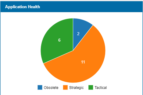
select o.ea_guid as Classguid, o.Object_type as BaseType, o.Stereotype as Stereotype, o.Name As GroupName, tv1.Value as Series from (t_object o left join t_objectproperties tv1 on tv1.Object_ID = o.Object_ID) where tv1.Property='Health Indicator'
Chart Shown in Dashboard
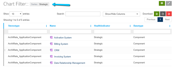
Result Query
select o.Stereotype as Stereotype, o.Name As Name, tv1.Value as HealthIndicator, o.ea_guid as Classguid, o.Object_type as BaseType from (t_object o left join t_objectproperties tv1 on tv1.Object_ID = o.Object_ID) where tv1.Property='Health Indicator' and tv1.Value = ‘’
Report shown when clicked on chart
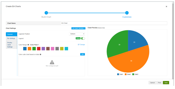
Customization Options
The following settings are available:
- General
- Legends position – You can position legend to place it on the Right or at the Bottom. You can change the options and check how they work by clicking on See Chart Preview.
- Legend – Disable to hide the legend.
- Color Range – Pick the color range that needs to be used while displaying the chart
- Color code chart based on data – Use this setting if you want to specify a particular color based on the data that will be showed in the dashboard.
For example, as per the configuration in the screenshot, the piece of pie which has “High” as the data will show up in red color in dashboard.
- Pie Settings
- Text Color – Specify the color of text shown on the chart
- Font family – Specify the font family of text shown on the chart
- Display Label Settings
- Position – Specify the position of Prefix/Suffix
- Prefix/Suffix – Specify prefix or suffix to values that need to be shown. For example, if you are displaying cost, you can set the prefix as $
- Format Numbers – Enable this setting to format numbers on charts