
Build Bubble Charts
Prolaborate provides a powerful yet intuitive tool to build Bubble charts based on Enterprise Architecture data in minutes.
These three-dimensional Bubble charts help you visualize complex data as a simple visualization.
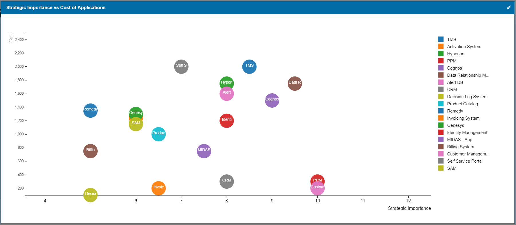
Here we are plotting the Strategic Importance vs the complexity of the applications. Cost of each application is represented as the size of the bubble.
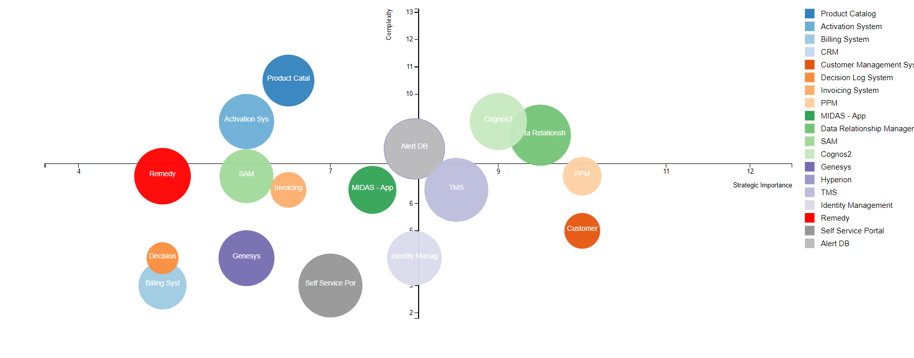


We can easily identify the best applications to renew are the ones at the bottom right quadrant.
Apps representing large bubbles in the top left quadrant needs to be reviewed seriously.
Note we will be looking only at the capabilities of chart widgets in this guide-; please refer to Dashboard Designer to learn about the general functionalities of the dashboard.
Build using Chart Designer
To create a Chart, click on Menu > Dashboards. Click on Add New to create a new dashboard or edit icon to edit a dashboard.
Click on Add Widget or Add icon on the bottom right to see the list of widgets. Click on EA Chart and then on Add New Widget.
Select Bubble and click on Designer.
Follow these steps to create a bubble chart:
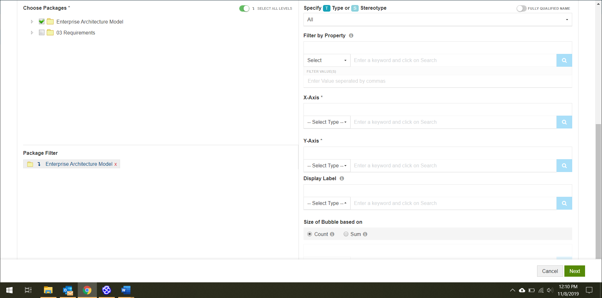
- Choose the packages that contain the data for your chart i.e., the packages that has the EA objects which should be considered for the chart.
- Filters:
- Specify the Type or Stereotype of elements that should be considered for the chart
- Specify a Property. Elements only with the specified property will be considered for the chart
- You can even specify particular values for the selected property. For example, consider only applications with Status as Production
- Choose basic attributes or tagged values based on which you want to plot the graph in X-axis and Y-axis
- Specify what you want to see on the chart under Display Label. Normally, Name is used as shown in the example below.
- You can also specify a property and the size of the bubble will be shown based on the same. It can either be based on
- Count of values returned by your specification
- Or on Sum of values of a property you specify
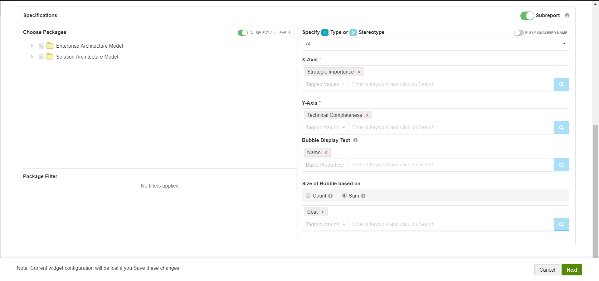
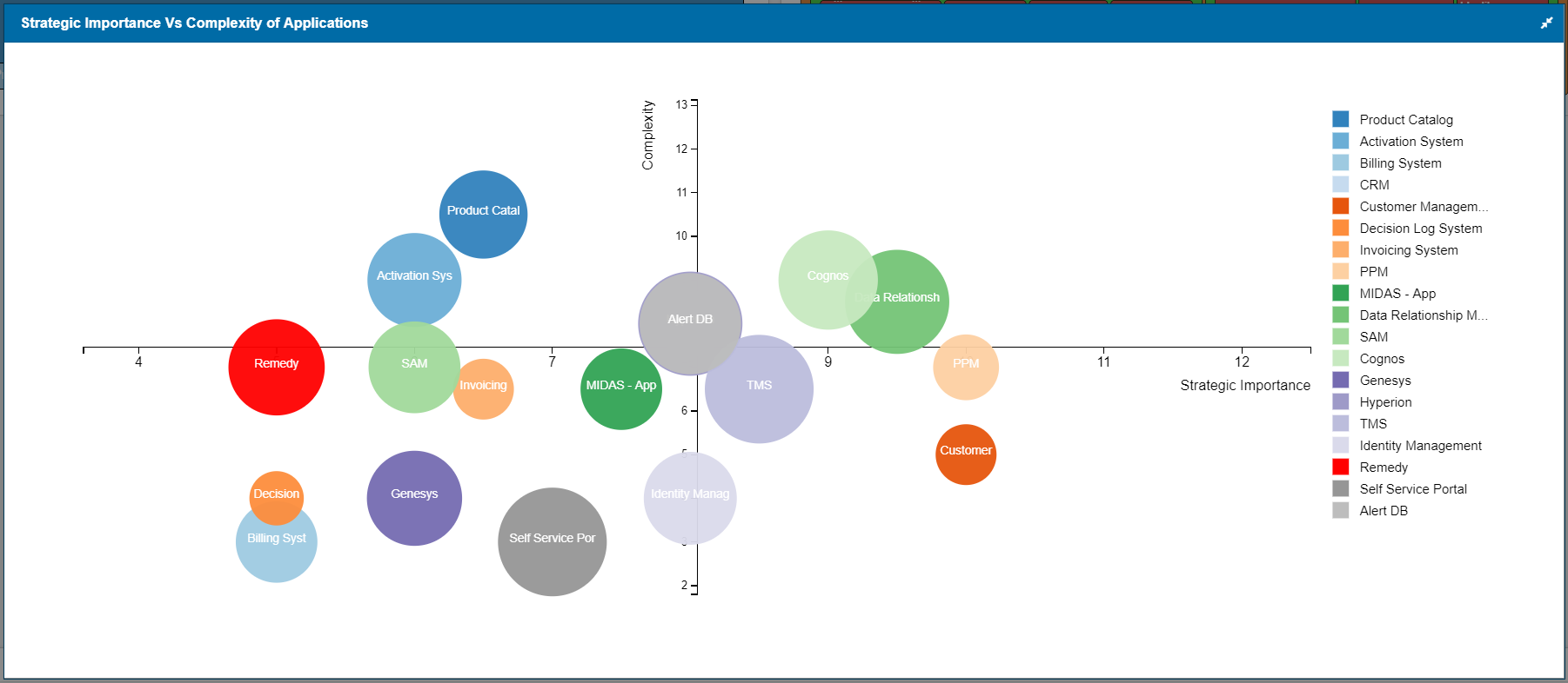
Sample Configuration and Result
Configuration:
Result:
Build using SQL Queries
When you are building advanced charts using SQL queries, Chart query is used to build the charts and Result query is used to show in-depth information on click.
Aliases that can be used in Bubble chart are xvalue and yvalue. The chart will be plotted based on these values in x-axis and y-axis.
For example,
select object_type as xvalue, stereotype as yvalue from t_object
If these aliases are not used, just bubbles will be shown in the dashboard.
Optionally, you can use the alias “ChartValue” if you want to display an integer value from a tagged value instead of counts on bubbles.
To enable users to see in-depth information on click of a section of the chart, Aliases in Chart query need to be used in Result Query.
For example, if chart query is
select object_type as series from t_object
the respective result query will be
select name, object_type, stereotype where object_type = ‘’
Additionally, you can use the following aliases in Result query:
a. Add alias “classguid” to the GUID – to see details of an item on click, For example:
select name,ea_guid as classguid from t_object where object_type = ‘’
b. Add aliases – Base Type and Stereotype to Type and Stereotype respectivelyto see appropriate EA icons, For example:
select name, object_type as basetype, stereotype as stereotype from t_object where object_type = ‘’ and stereotype= ‘’
c. Prefix an alias with “hide_” to not see a column even when used in the query. For example, the following query will give the same result as above, but Base Type and Stereotype columns will not be shown in the result:
select name, object_type as hide_basetype, stereotype as hide_stereotype from t_object where object_type = ‘’ and stereotype= ‘’
Aliases should not contain any space.
Sample Query and Result
Chart Query
select o.Name as Series, otv1.Value as xvalue, otv2.Value as yValue from ((t_object o left join t_objectproperties otv1 on otv1.Object_ID = o.Object_ID) left join t_objectproperties otv2 on otv2.Object_ID = o.Object_ID) where otv1.Property = 'Strategic Importance' and otv2.Property = 'Cost'
Chart Shown in Dashboard
Result Query
select o.Name as Application, otv1.Value as StrategicImportance, otv2.Value as Cost from (( t_object o left join t_objectproperties otv1 on otv1.Object_ID = o.Object_ID) left join t_objectproperties otv2 on otv2.Object_ID = o.Object_ID) where otv1.Property = 'Strategic Importance' and otv2.Property = 'Cost' AND o.Name = ''
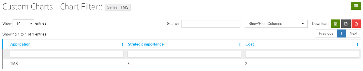
Report shown when clicked on chart
Customization Options
The following settings are available:
- General
- Legends position – You can position legend to place it on the Right or at the Bottom. You can change the options and check how they work by clicking on See Chart Preview.
- Legend – Disable to hide the legend.
- Color Range – Pick the color range that needs to be used while displaying the chart
- Color code chart based on display label – Use this setting if you want to specify a particular color based on the data that will be showed in the dashboardFor example, as per the configuration in the screenshot, the piece of pie which has “Data Management System” as the data will show up in red color in dashboard
- Bubble Settings
- Bubble Text – Switch this off to hide the label shown on bubbles
- Font Color, family, and size – Specify the font style for the label shown on bubbles using these settings
- Position – Use this setting to control the position of labels
- Minimum and maximum radius – Use these settings to make the differences in bubble size more pronounced. Applicable when you
- Connectors on Hover – When enabled, connectors will be shown from bubbles to axes when you hover over a bubble
- Graph Settings
- X-axis, Y-axis and Z-axis and Label – Give a name to the axes. These labels enhance readability of charts
- Quadrants – When enabled, x and y-axis will be repositioned as shown in the sample above.
- Display Label Settings
- Position – Specify the position of Prefix/Suffix
- Prefix/Suffix – Specify prefix or suffix to values that need to be shown. For example, if you are displaying cost, you can set the prefix as $
- Format Numbers – Enable this setting to format numbers on charts