
Build Nested Pie Charts
Prolaborate provides a powerful yet intuitive tool to build Nested Pie Charts based on Enterprise Architecture data in minutes.
With these powerful visualizations, you can present any kind of architectural views in a single page. Here is what you can do:
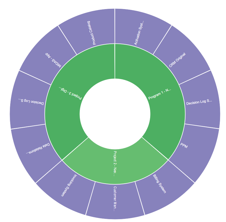
Quick Overview of business process or applications:
For example, here we see Projects and the Applications used in them.


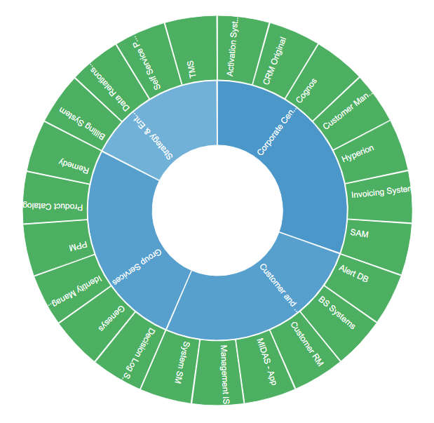
Processes or applications grouped based on a property:
For example, Applications grouped by Business Unit:
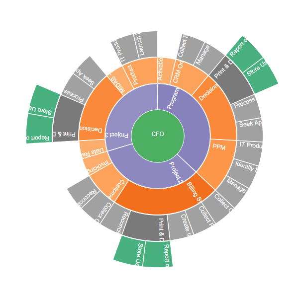
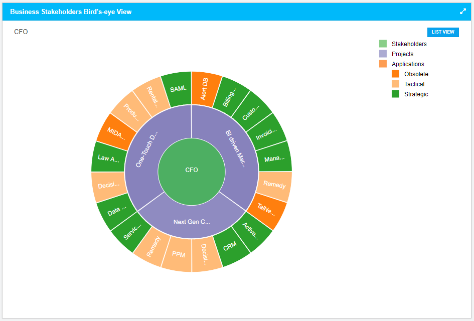
End to End Relationships:
For example, here we see how the following are interconnected – Roles, processes, applications, business activities, and requirements.
Note we will be looking only at the capabilities of chart widgets in this guide-; please refer to Dashboard Designer to learn about the general functionalities of the dashboard.
Build using Chart Designer
To create a Chart, click on Menu > Dashboards. Click on Add New to create a new dashboard or edit icon to edit a dashboard.
Click on Add Widget or Add icon on the bottom right to see the list of widgets. Click on EA Chart and then on Add New Widget.
Select Nested Pie and click on Designer.
Follow these steps to create the chart:
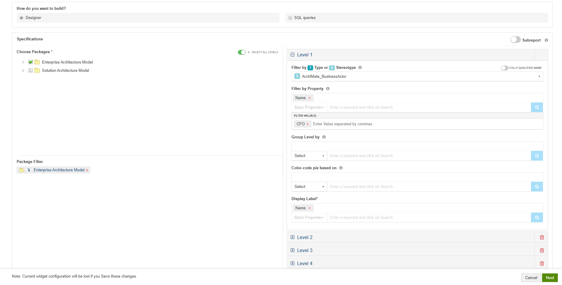
- Choose the packages that contain the data for your chart i.e., the packages that has the EA objects which should be considered for the chart.
- Filters:
- Specify the Type or Stereotype of elements that should be considered for the chart
- Specify a Property. Elements only with the specified property will be considered for the chart
- You can even specify particular values for the selected property. For example, consider only applications with Status as Production
- You can also
- group this selection if needed by specifying a property under Group Level 1 by
- Color-code the pie based on a property. For example, color-code pie based on Priority – High. Medium, and Low. If you want to specify particular color based on priority (Say red for high, yellow for medium, and green for low), you can do it in the next step
- Choose the information you want to show on the chart using Display Label. Mostly, Name is used.
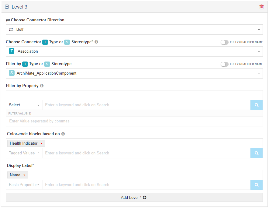
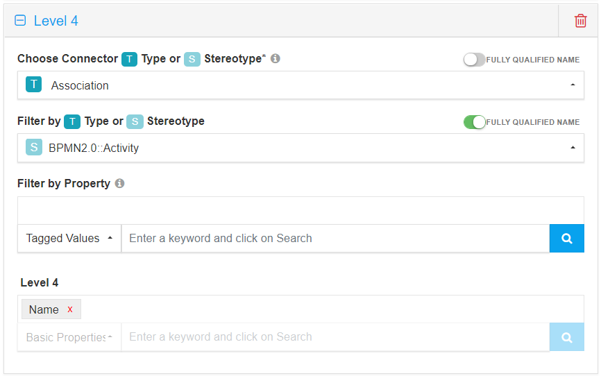
Repeat the following steps to add more levels to the chart:
- Filters:
- Choose the direction of Connectors to be considered for this level
- Choose the type of relationship (Connector Type or Stereotype) between the elements you have chosen in the previous level with those you want to choose in this level
- Specify the Type or Stereotype of elements that should be considered in this level
- Specify a Property. Elements only with the specified property will be considered. You can even specify particular values for the selected property
- Color-code the pie based on a property
- Choose the information you want to show on the chart in this level in Display Label
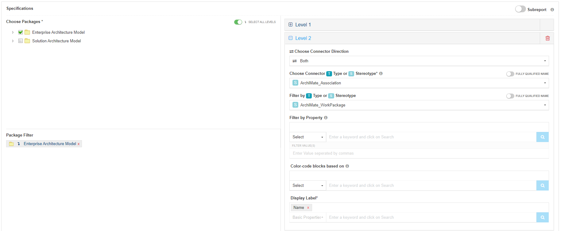
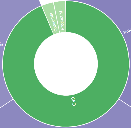
Sample Configuration and Result:
Configuration – Level 1:
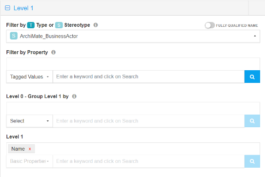
Result – Level 1:
Configuration – Level 2:
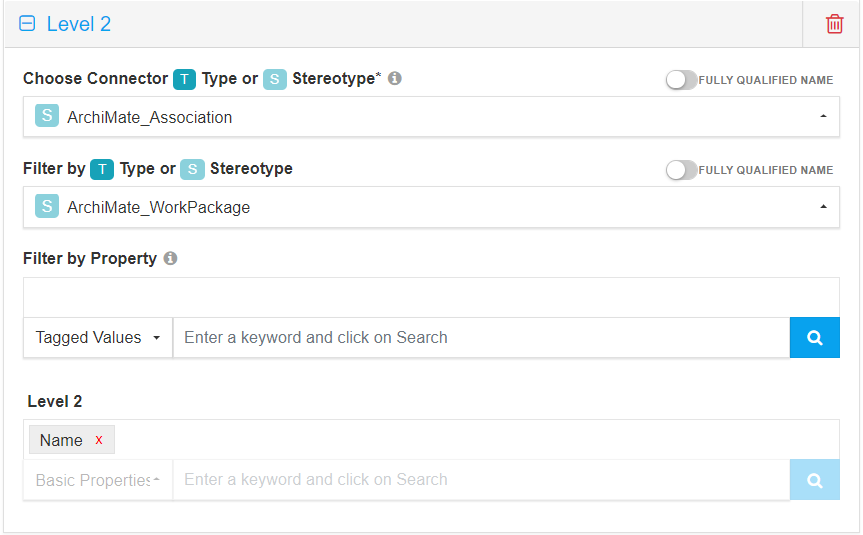
Result – Level 2:
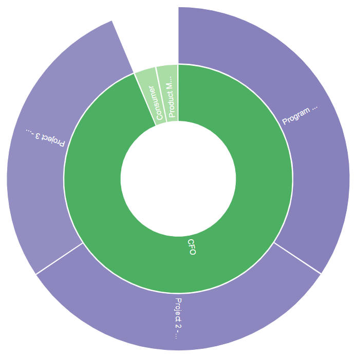
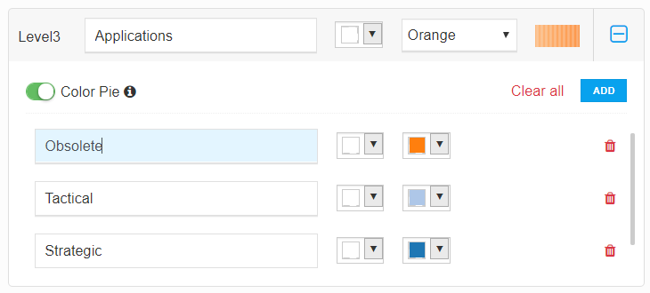
Configuration – Level 3:
Result – Level 3:
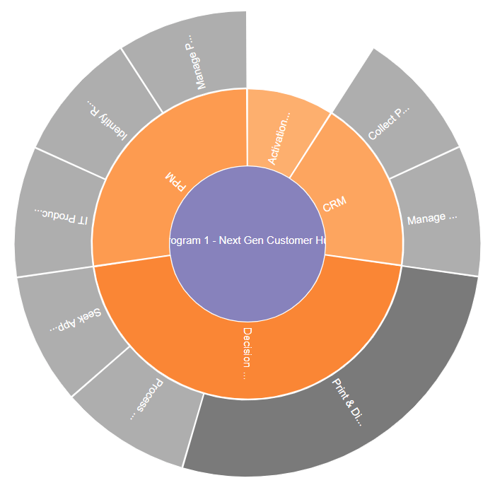
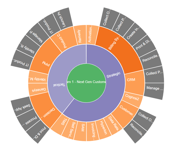
Configuration – Level 4:
Result – Level 4:
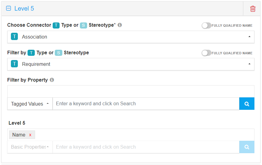
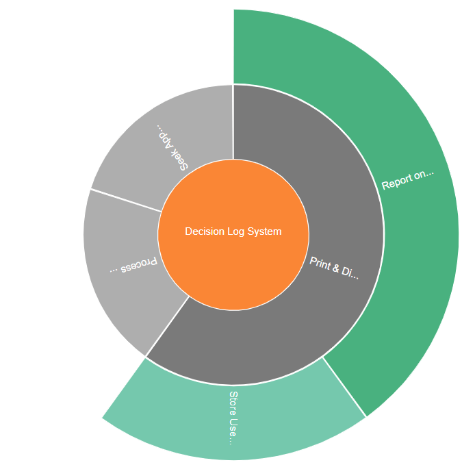
Configuration – Level 5:
Result – Level 5:
Build using SQL Queries
When you are building advanced charts using SQL queries, Chart query is used to build the charts and Result query is used to show in-depth information on click.
This chart will be created based on the property you define using the Series alias. Optionally you can group them using groupname alias.
As this is a multi-level chart, you can have many levels of Chart query and result query. You can click on List View to see the table view similar to the ones shown in above samples.
And to link one level to the another, you need to use the following syntax:
level[number].[alias of the property used in it] = level[number].[alias of the property using in it]
For example,
level2.ObjectID = level1.startelementid
To enable users to see in-depth information on click of a section of the chart, Aliases in Chart query need to be used in Result Query.
For example, if chart query is
select object_type as series from t_object
the respective result query will be
select name, object_type, stereotype where object_type = ‘’
Additionally, you can use the following aliases in Result query:
a. Add alias “classguid” to the GUID – to see details of an item on click, For example:
select name,ea_guid as classguid from t_object where object_type = ‘’
b. Add aliases – Base Type and Stereotype to Type and Stereotype respectivelyto see appropriate EA icons, For example:
select name, object_type as basetype, stereotype as stereotype from t_object where object_type = ‘’ and stereotype= ‘’
c. Prefix an alias with “hide_” to not see a column even when used in the query. For example, the following query will give the same result as above, but Base Type and Stereotype columns will not be shown in the result:
select name, object_type as hide_basetype, stereotype as hide_stereotype from t_object where object_type = ‘’and stereotype= ‘’
Aliases should not contain any space.
Sample Queries and Results
This is also a multi-level chart; you can have many levels of Chart query and result query.
Chart Query – Level 1:
select target.Object_ID as startelementid, source.Name as GroupName, target.Name as Series from ((t_object source left join t_connector con on con.Start_Object_ID = source.Object_ID) join t_object target on target.Object_ID = con.End_Object_ID) where source.Stereotype='ArchiMate_BusinessActor' and target.Stereotype='ArchiMate_WorkPackage'
Chart Shown in Dashboard
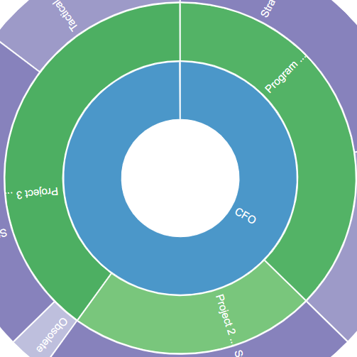
Chart Query – Level 2:
select target.Object_ID as startelementid, source.Name as GroupName, op.Value as Series, source.Object_ID as ObjectID from (((t_object source left join t_connector con on con.Start_Object_ID = source.Object_ID) join t_object target on target.Object_ID = con.End_Object_ID) left join t_objectproperties op on op.Object_ID=target.Object_ID) where source.Stereotype='ArchiMate_WorkPackage' and target.Stereotype='ArchiMate_ApplicationComponent' and op.Property = 'Health Indicator'
Condition to link to Previous Level:
level2.ObjectID = level1.startelementid
Chart Shown in Dashboard
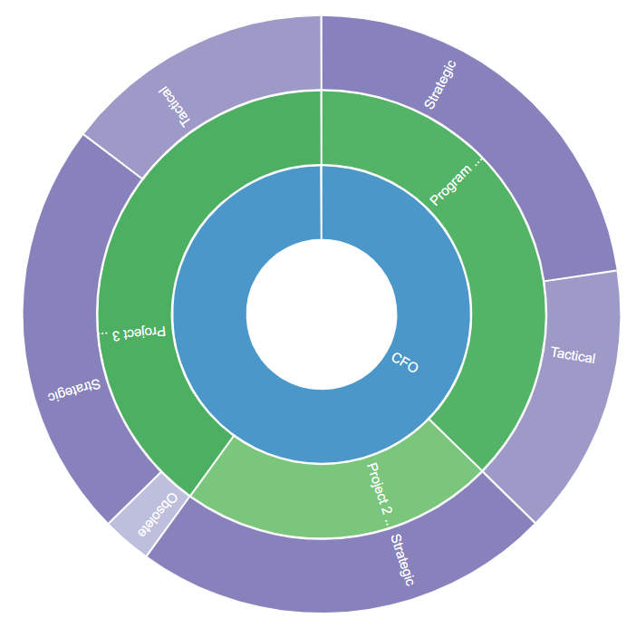
Chart Query – Level 3:
select source.Object_ID as startelementid, source.Name as Series, op.Value as GroupName from (t_object source join t_objectproperties op on op.Object_ID=source.Object_ID) where op.Property = 'Health Indicator'
Condition to link to Previous Level:
level3.GroupName = level2.series
Chart Shown in Dashboard
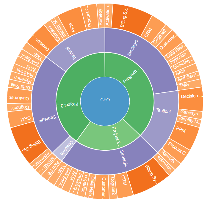
Chart Query – Level 4:
select source.Name as GroupName, target.Name as Series, source.Object_ID as ObjectID from((t_object source left join t_connector con on con.Start_Object_ID=source.Object_ID) join t_object target on target.Object_ID=con.End_Object_ID) where target.Stereotype='Activity'
Condition to link to Previous Level:
level4.ObjectID=level3.startelementid
Chart Shown in Dashboard
Customization Options
Nested Pie has following settings:
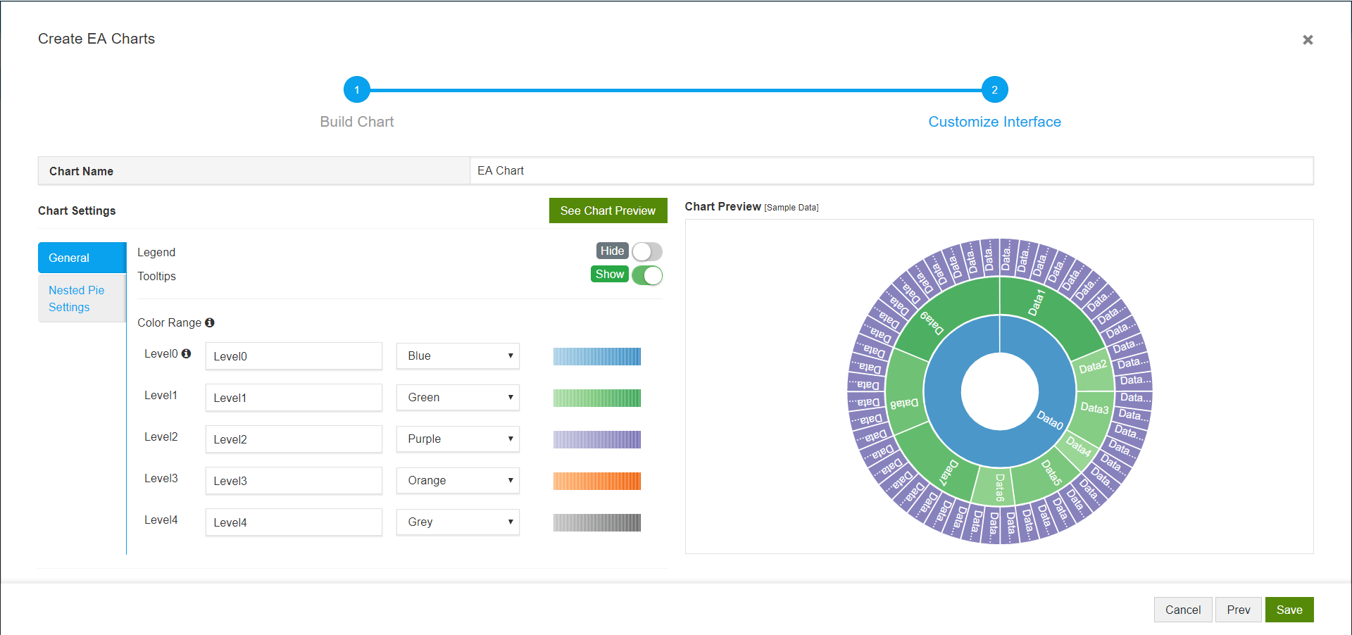
- General
- Legend– Disable to hide the legend.
- Information on Hover – Disable to hide the information that is shown on hover
- Color Range
- Label – Give a title for each level
- Text – Specify the color of text shown on chart
- Fill – Pick the color range that needs to be used while displaying the chart
- Specify colors – Use this setting to specify color as per your choice based on the property chosen in the previous step using Color-code pie based on setting
- Nested Pie Settings
- Show names of all Pie – Disable to hide the names that is shown on the chart
- Show all levels by default – Disable to show only a specific number of levels irrespective of levels configured. If enabled, all the levels will be shown when the chart loads
- Breadcrumb navigation bar – Disable to hide the breadcrumb navigation
- Font family – Specify the font family of text shown on the chart