
Help Center
Build Matrix Charts
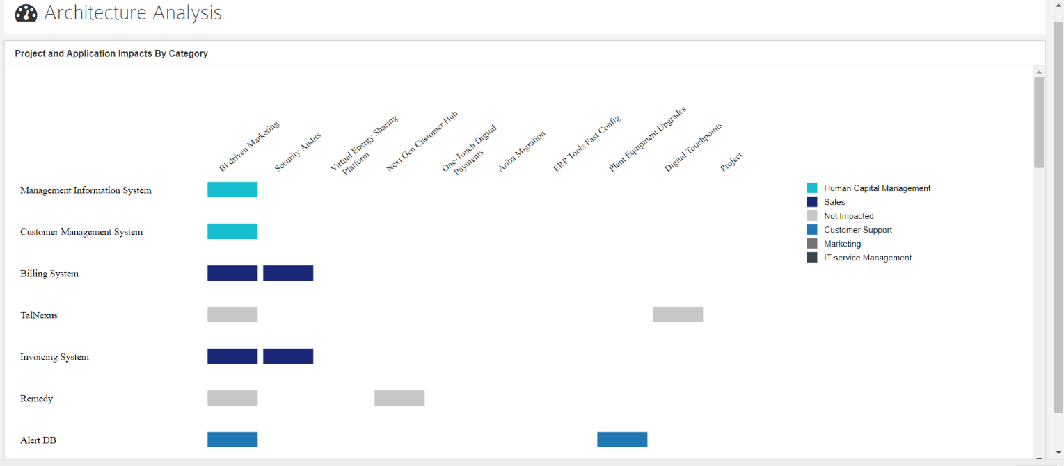
Visualize multi-fact Application and Strategic Data juxtaposed on 2 dimensions to provide a single intuitive way to drive better Architecture Insights.
Please refer to Dashboard Designer to learn about the general functionalities of the dashboard.
Build using SQL Queries
The matrix chart will be plotted based on xvalue, yvalue, and series
Sample Query and Result
Chart Query
select app.Name as yvalue, proj.Name AS xvalue, ISNULL(category.Value, 'Not Impacted') Series from t_object app left join t_connector projCon on projCon.End_Object_ID = app.Object_ID left join t_object proj on proj.Object_ID = projCon.Start_Object_ID join t_objectproperties category ON category.Object_ID = app.Object_ID where app.Stereotype in ('pl_cotsapplication', 'PL-Architecture::pl_cotsapplication') AND proj.Stereotype in ('pl_project', 'PL-Architecture::pl_project')AND projCon.Stereotype IN('pl_association', 'PL-Architecture::pl_association') AND category.Property = 'Category'
Chart Shown in Dashboard


Customization Options
- General
- Legend – Disable to hide the legend.
- Font family – Specify the font family of text shown on bar
- Customize Colors – Pick the color that needs to be used while displaying the chart
- Label – Legend to explain a particular level
- Text – Specify the color of text shown on chart
- Fill – Pick the color that needs to be used while displaying the chart
- Border – Border and header color of the rectangles
- Matrix Settings
- Show label on Blocks – Switch this off to hide the label shown on box
- Font Color and family – Specify the font style for the x-axis and y-axis label shown using these settings
- Display Label Settings
- Position – Specify the position of Prefix/Suffix
- Prefix/Suffix – Specify prefix or suffix to values that need to be shown. For example, if you are displaying cost, you can set the prefix as $