
Dashboard
Prolaborate lets you design intuitive personalized dashboards.
Once an user logs in or gets automatically logged in using SSO, they land straight onto the live and dynamic dashboards specifically designed for them.
All the architecture information that they need to consume are presented to them in a single page, thus making it a delightful experience for them.
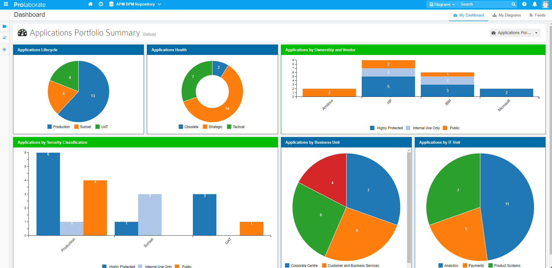
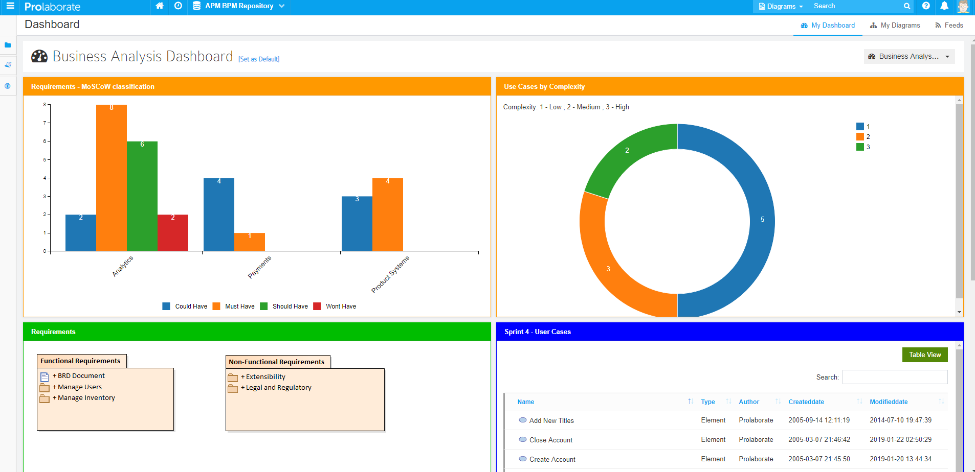
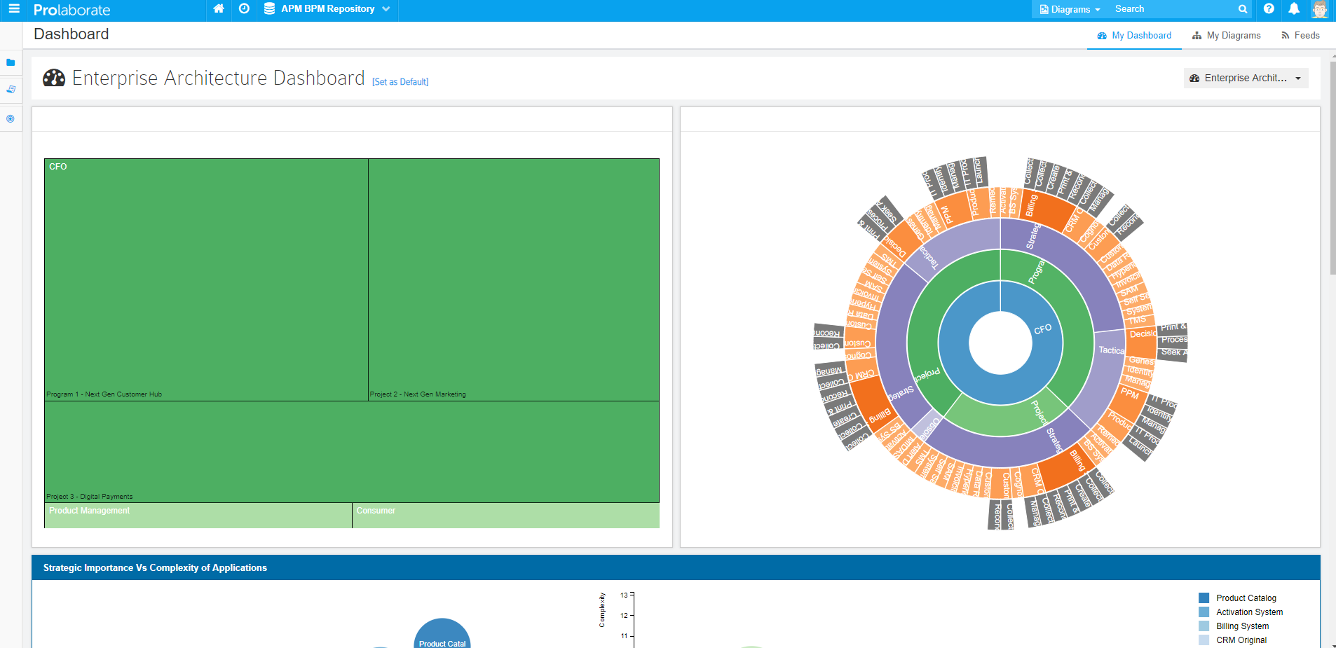
Here are few dashboards created from a single model. They are assigned to specific teams.
Application Portfolio Management team:


Business Analysis team:
Enterprise Architecture team:
This user guide covers the following Workflows:
- Create a Dashboard
- Manage Access
- Preview a Dashboard
- Set a Dashboard as Default
- Manage Dashboards
Create a Dashboard
Click on Menu > Dashboards to see the list of Dashboards created in Prolaborate.
Click on Add Dashboard
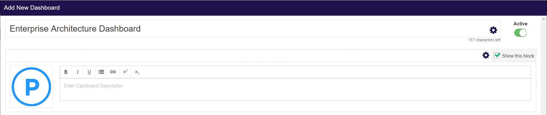
If you want to create a new dashboard, click on Create and fill the details as below:
| Field | Description |
|---|---|
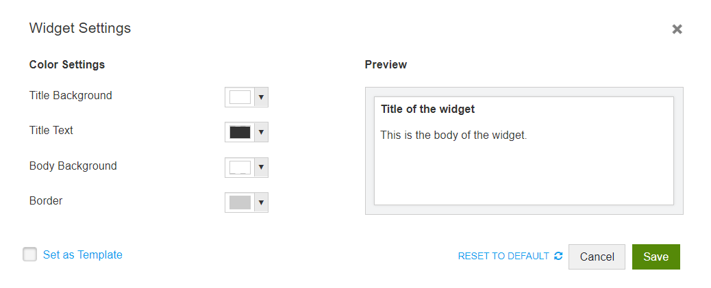
| Name | Give a name to the Dashboard. This can be used to signify the purpose of the dashboard (Say Review Widgets) or the Audience of the dashboard (Say Enterprise Architect Modelers’ Dashboard) |
| Name – Settings | Use these settings to set custom colors to text, background, and border |
| Status | This is set to Active by default. Do not change it as inactive dashboards will not be used anywhere in Prolaborate. |
| Logo and Description | You can insert an image or a logo for the Dashboard. You can also add a description to the dashboard. Through the description, you can give specific instructions to the audience of the dashboard. You can hide this section by unselecting Show this block. option if this block is not relevant to you. |
| Description – Settings | Use these settings to set custom colors to text and background |
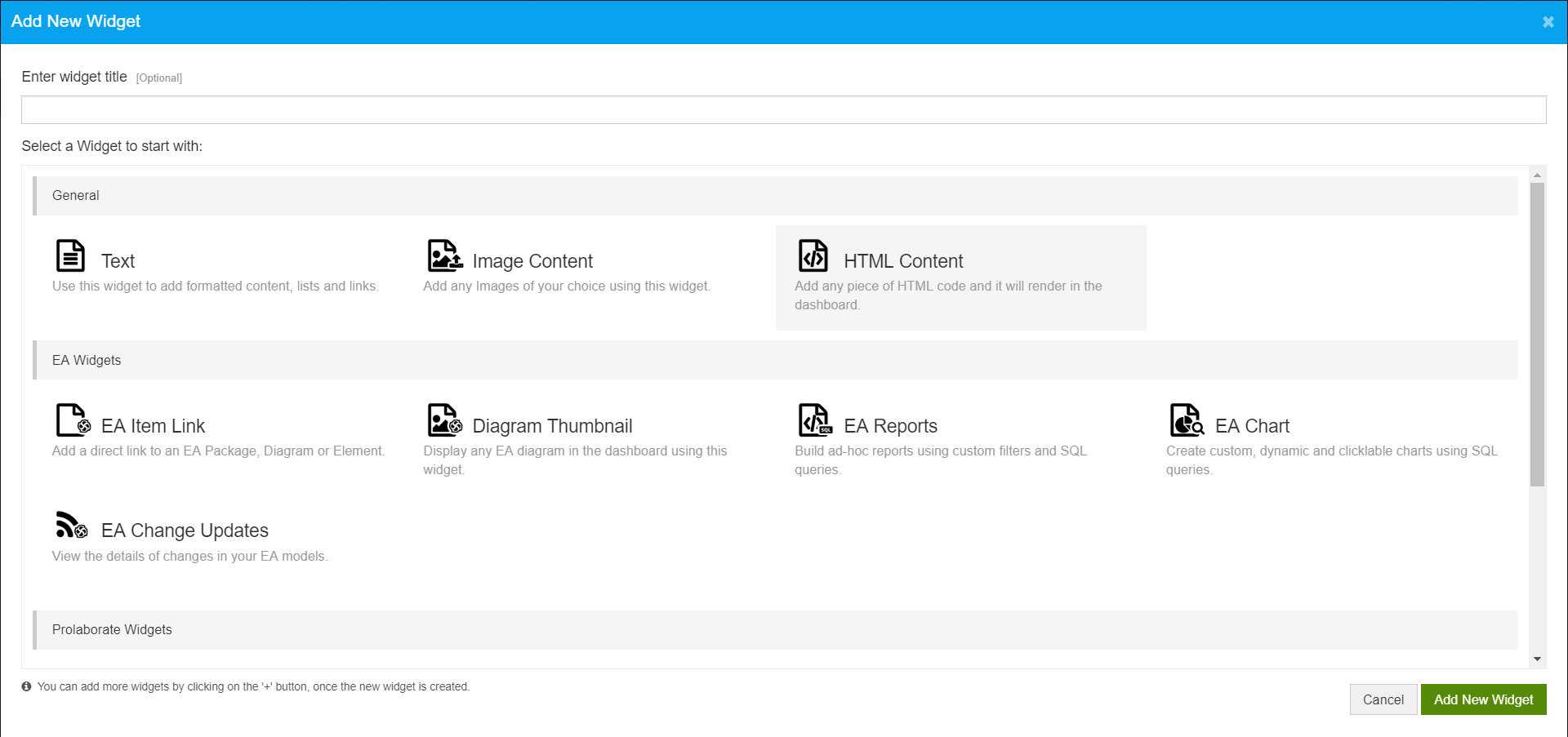
To add a widget, click on Add Widget, give a title to the widget, select the widget type, and click on Add New Widget.
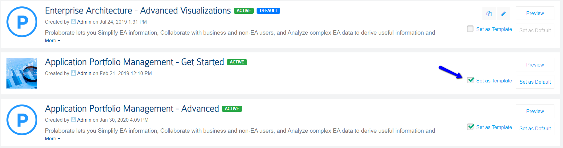
If you want to reuse a dashboard, click on Choose a Template. You will be shown the list of dashboards you have marked as a template across the repositories.
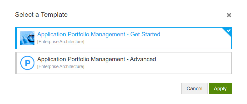
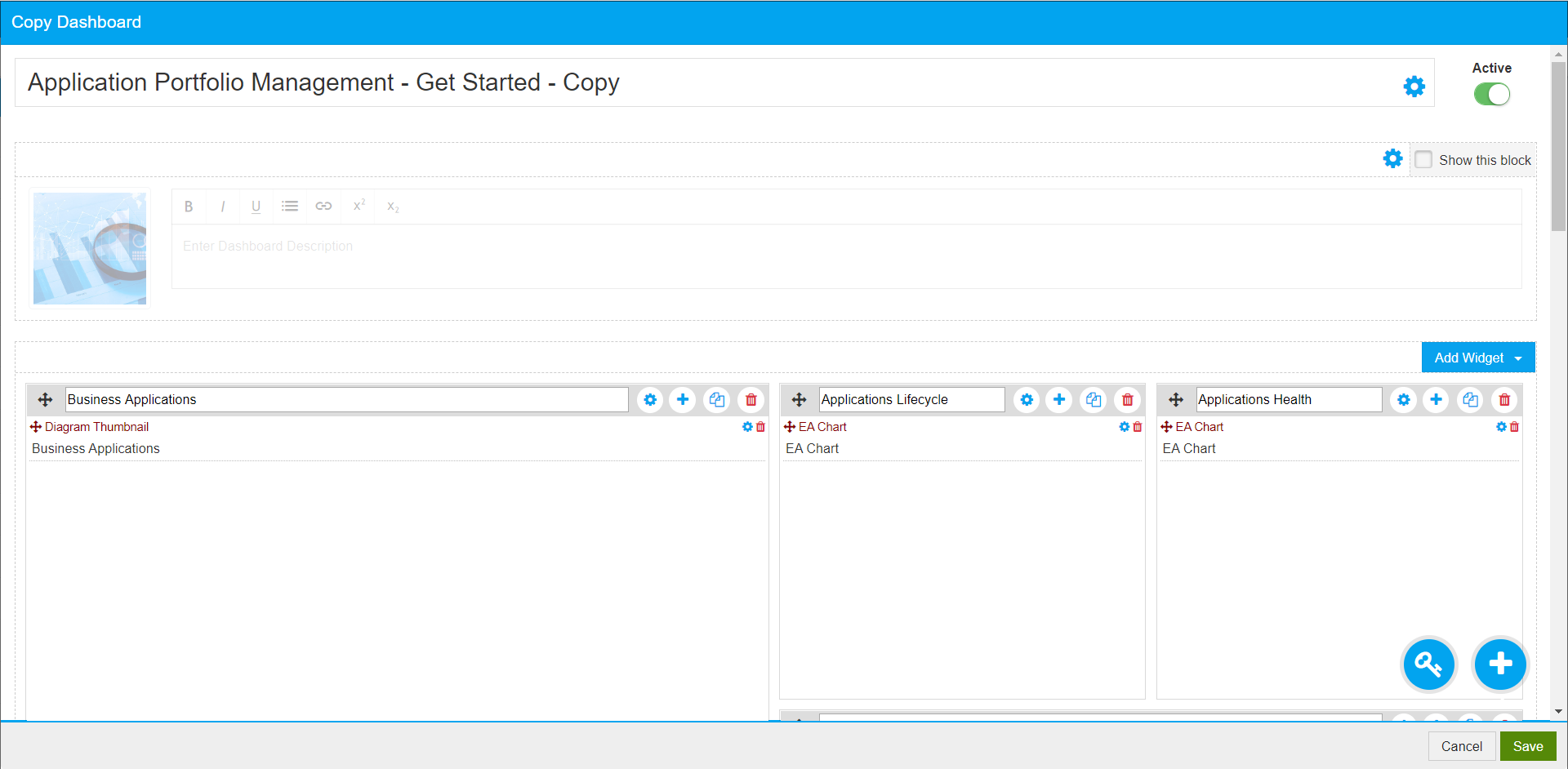
Choose a template and click on Apply. A copy of the dashboard will be created; you can update the dashboard and click on Save.
To set a dashboard as template, just enable this setting.
Features of Widget
The features of the widget are detailed below.
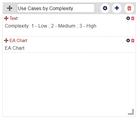
- Widget configuration will be based on the type of widget you choose
- All the widgets are re-sizeable. You can resize it as per the content which is going to appear in the widget
- Widgets can be relocated as per your wish
- You can view every widget in a full screen view from your dashboard
- Multiple widgets can be added in a single widget. You can move them, re-configure them or even delete them
- You can set a custom color to title and body of each widget.
- You can set a widget as template to re-use it anywhere in Prolaborate
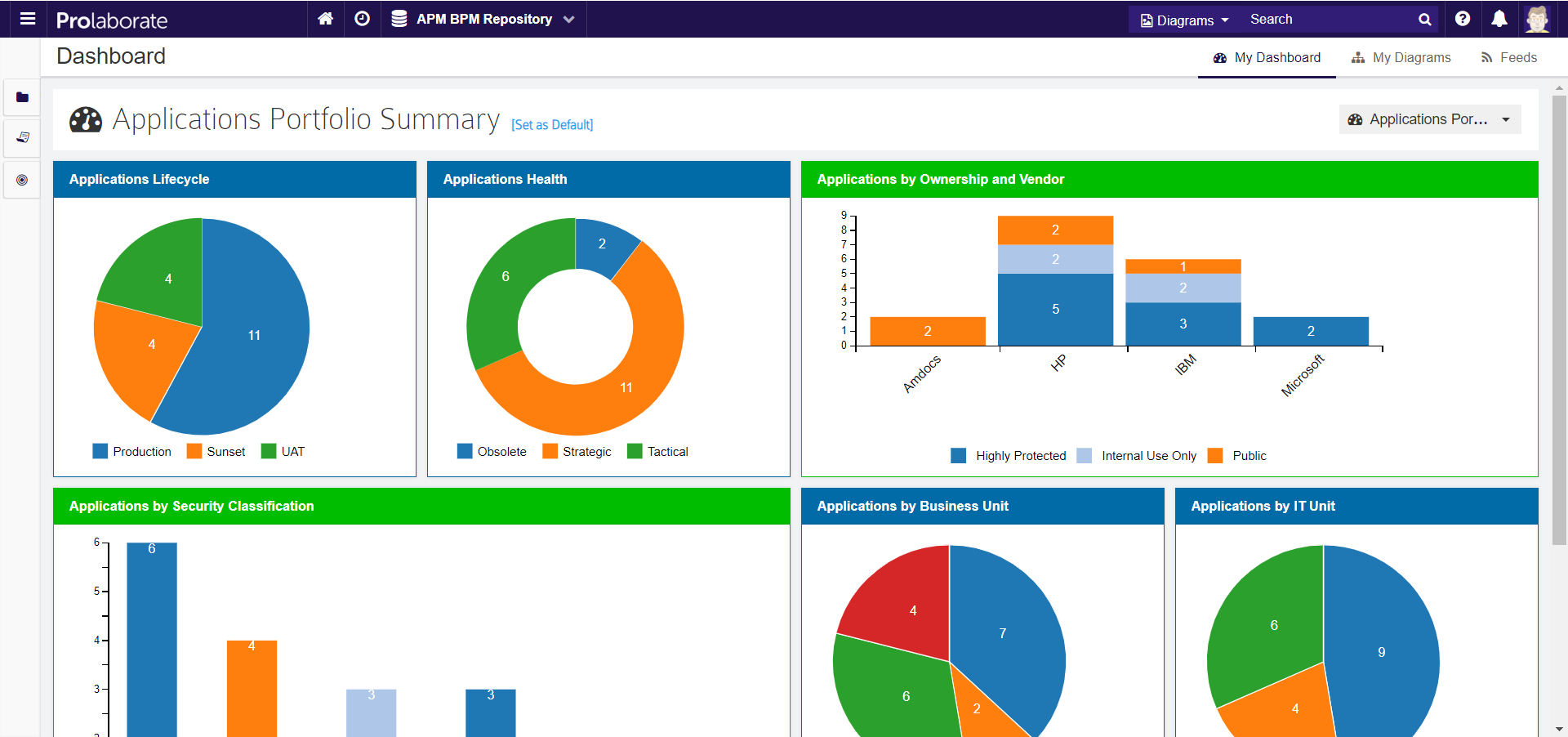
Here is a dashboard color-coded based on user’s requirements:
Dashboard Widgets
The following types of widgets are available in Prolaborate:
- General
This set of widgets let you add general information like text, images, etc. - EA Widgets
With the multiple EA widgets that are present, you can bring in various data and information from EA. - Prolaborate Widgets
These widgets let you add Prolaborate data and information like Reviews, discussions, etc. - Integration widgets
Integration widgets let you pull in data from the applications integrated with Prolaborate.
Text
A Text widget is a free form text field where you can add any content as per your wish.
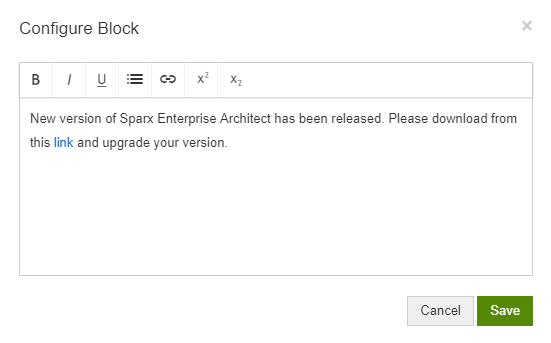
There are wide range of options to format the content as per your requirements. You can do the following:
- Make text as Bold or Italic
- Underline text
- Create ordered and unordered lists
- Add superscript and subscript
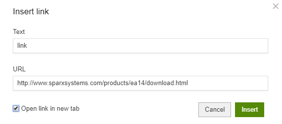
- Add links
How it looks in the Dashboard?
Clicking on the link will open the link in a new tab as configured above.
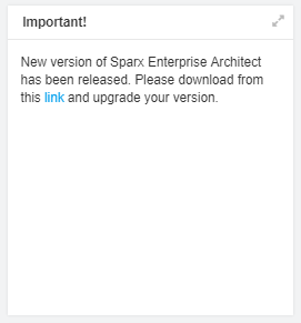
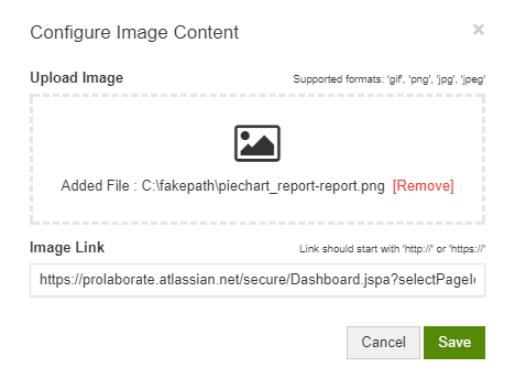
Image Content
Add Images of your choice using this widget. You can even add a link to the image you are adding.
How it looks in the Dashboard?
You can view the image in full screen view by clicking on the icon on the top right of the widget. Clicking the image will open the link which you have configured.
HTML Content
This is the most powerful widget as you can show anything you want exactly in the way you want it to be. Add any HTML code in the configuration field.
How it looks in the Dashboard?
As you can see, the content is getting shown as per the HTML code.
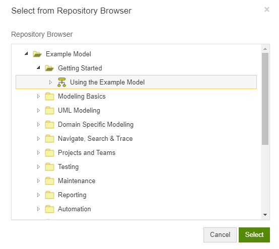
EA Item Link
The EA Item Link widget helps you get quick access to an Enterprise Model, Package or Element. You can select any artifact from your Enterprise Architect model.
How it looks in the Dashboard?
Clicking on an item opens the overview or diagram of that item.
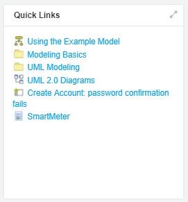
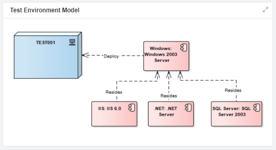
Diagram Thumbnail
To see an Enterprise Architect Diagram in the dashboard, you can use this widget. Widget configuration needs to be done in the same way as above but you need to select only diagrams.
How it looks in the Dashboard?
The diagram from EA will be shown in the dashboard as-is. You can click on the diagram to see its details or interact with the diagram.
EA Reports
Please refer to EA Reports user guide to know about EA reports.
EA Charts
Please read EA Charts user guide to know about EA Charts.
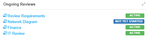
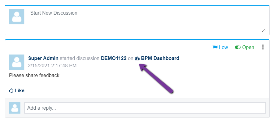
Review List
This widget lists all the reviews which are either started by you or being reviewed by you and their statuses. No configuration is required.
How it looks in the Dashboard?
As you can see, the list of reviews is being shown with their status.
Feeds – Quick Links
This widget provides you links to all the filters in the Feeds like Open discussions, High priority discussions, etc. So, you can land on the important discussions in a single click.
How it looks in the Dashboard?
Clicking on any of the link will take you to Feeds page and discussions with respect to the selected filter will be shown to you.
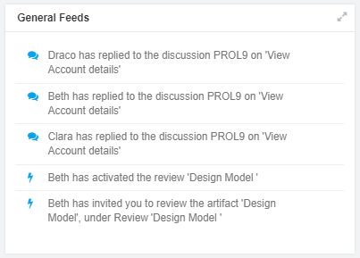
General Feeds
General Feeds gives a quick glance of the recent notifications. To see all the notifications, click on Notifications icon.
How it looks in the Dashboard?
Click on any of the item to see the details.
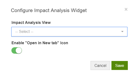
Impact Analysis View
This widget lets you bring the Impact Analysis views you have created direct to your dashboard.
Select the View from the dropdown and click on Save. “Open in New Tab” icon will be shown in the dashboard if this toggle is enabled.
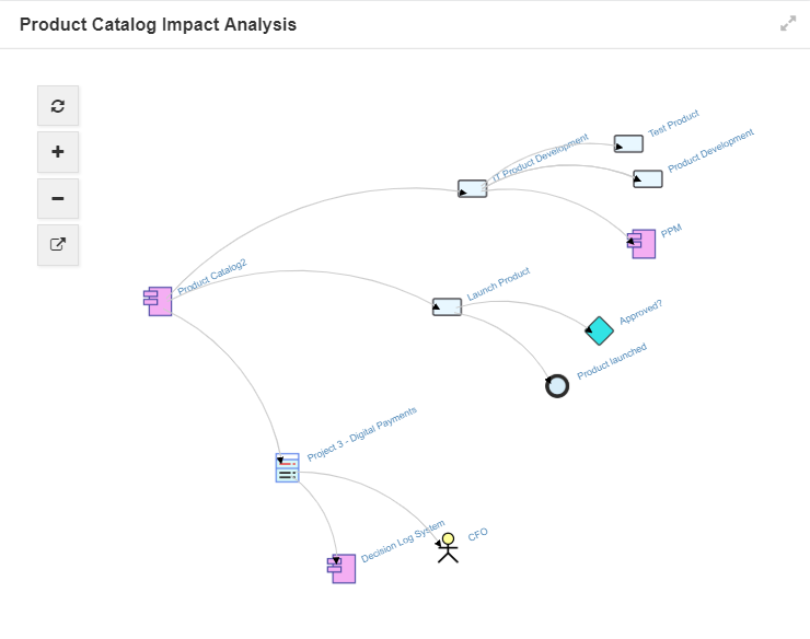
How it looks in the Dashboard?
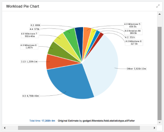
Discussions Summary
Use this widget to show a summary of discussions that are happening on diagrams, list of elements like requirements or use-cases, or packages.
After selecting a widget, follow these steps:
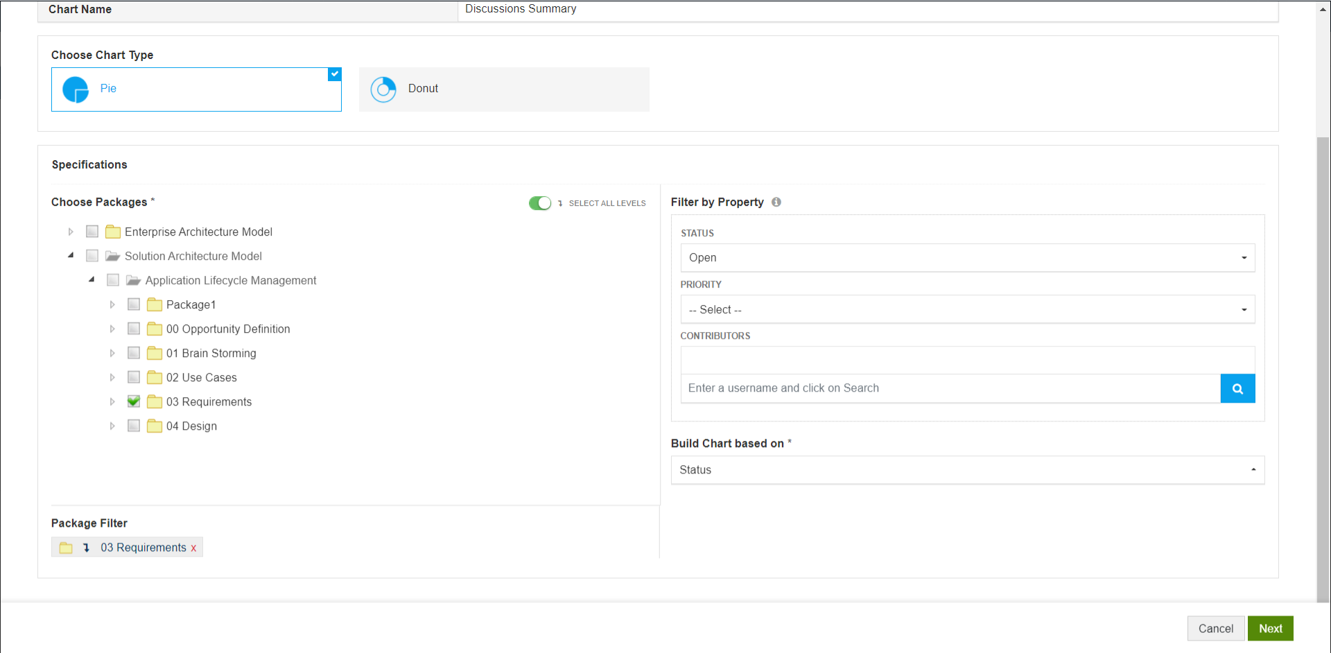
- Select a chart type – Pie or Donut
- Choose packages, diagrams, or elements
- Filter by Status, Priority or Contributors
- Select a property based on which the summary chart must be built
- Click on Next
- Customize the chart. Learn more about these settings here.
How it looks in the Dashboard?
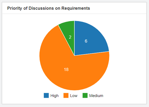
The users will be able to click on any of the pie to view the discussions.
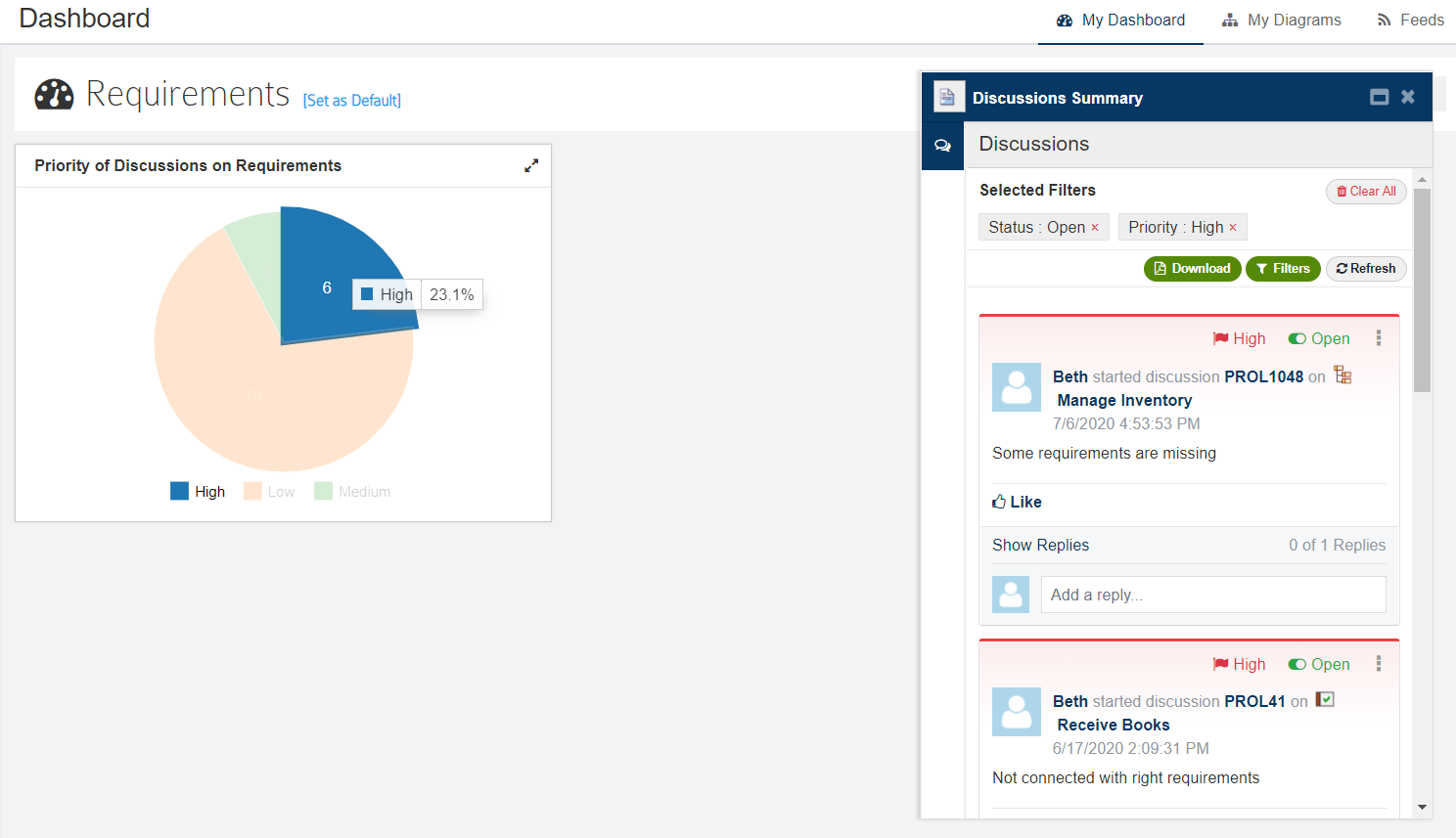
Discussions
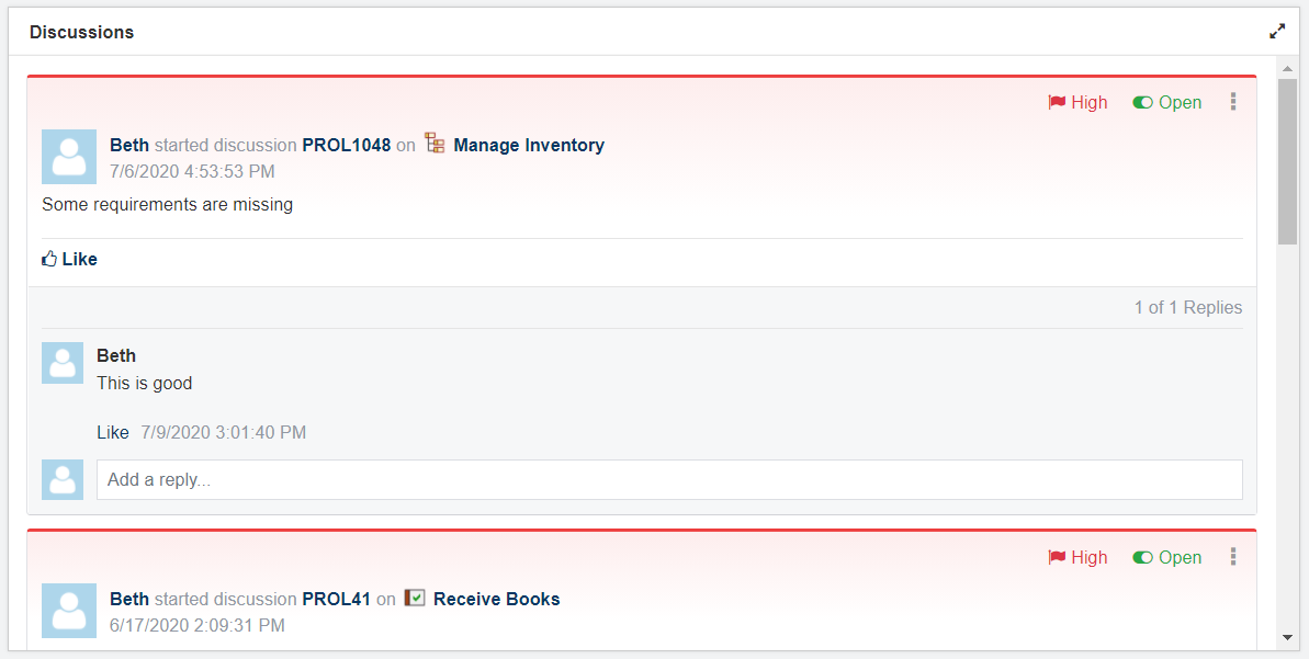
Use Discussions widget to make it easier for users to participate in discussions and encourage collaboration.
After selecting a widget, follow these steps:
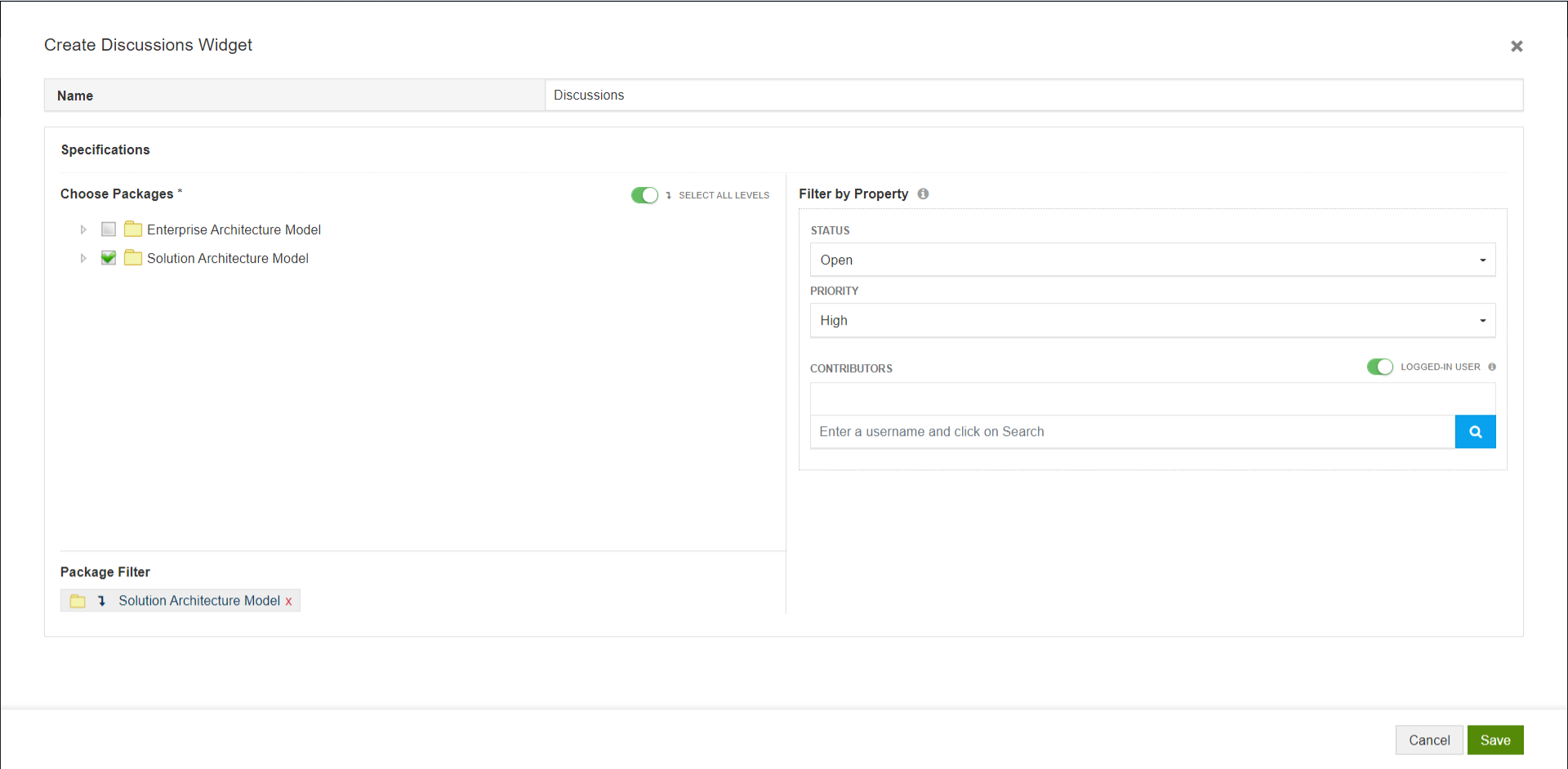
- Select a chart type – Pie or Donut
- Choose packages, diagrams, or elements
- Filter by Status, Priority or Contributors
- Toggle Logged-in user if you want the users seeing the widget to just the discussions they have created
- Click on Next
- Customize the chart. Learn more about these settings here.
How it looks in the Dashboard?
The users can view the discussions and reply to them just from the dashboard.
Review Summary Chart and Report
Refer to Reviews guide to learn more.
Dashboard Collaboration
This widget lets you and your colleagues discuss on the dashboard and widgets easily. This will come in handy when you have created Charts and Reports in Prolaborate.
Integration Report
Check out the capabilities of this widget in these links:
Bring Jira reports to Dashboard
Bring Azure DevOps reports to Dashboard
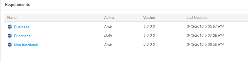
Embedded Documents
This widget lets you view the documents created using Enterprise Architect.
How it looks in the Dashboard?
You can click on the Name to see the details of documents, view and download them.
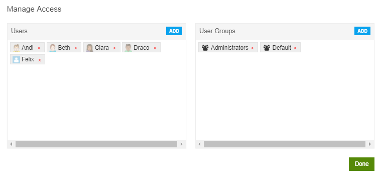
Manage Access
If you want to make this dashboard available for specific users and user groups, you can do so from Manage Access window.
If you want a dashboard to be the default dashboard to all the users, you need not add all of them in Manage Access, you can just set that dashboard as Default (Details in upcoming sections).
After you have designed the dashboard, click on Manage Access icon to the left of Add widget icon.
Preview
Use Preview option to see how the dashboard is going to look in the dashboard.
Set Default Dashboard
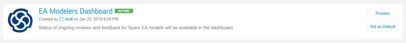
Customize the Dashboard for different users and user groups in your organization as per your requirements. For example, a dashboard for CxOs to give a status of all important tasks, a dashboard for Business Analysts to give details on review tasks, and a dashboard for Sparx Systems Enterprise Architect (EA) modelers to track their work and related discussions.
This feature greatly helps in making the landing view relevant for each and every Prolaborate user.
For Repository
To set a dashboard as default for all the users in a repository, click on Set as Default on a dashboard in the Dashboards page.
Default Repository dashboard can neither be deleted nor disabled.
For an User Group
To set a dashboard as default for a user group, open a user group’s details from Menu > User Groups page. You will see a default dashboard option. This user group will be given access to the dashboard which is set as default, if there is no access already.
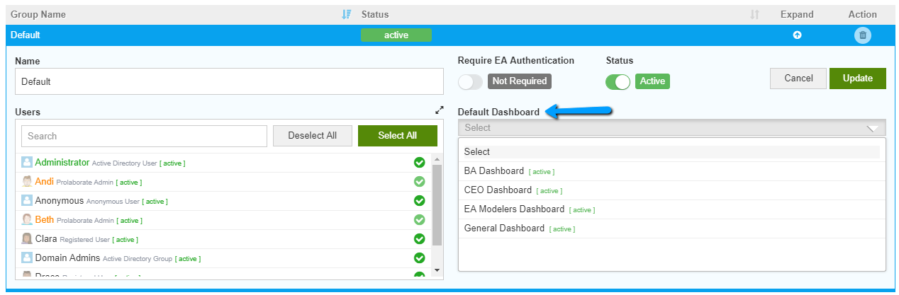
User group’s default dashboard has higher priority than Repository dashboard.
For an User
To set a dashboard as default for an user, open a user’s details from Menu > Users page. You will see a default dashboard option. This user will be given access to the dashboard which is set as default, if there is no access already.
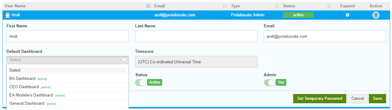
User’s default dashboard has higher priority than User group’s dashboard.
For Yourself
As a normal user, the above dashboards are set by the Admin of Prolaborate for you. If in case you want to see a different dashboard as default for yourself, you can do that from My Dashboard page. The yellow colored dropdown marked in the screenshot below gives you the list of all dashboards which you have access to. You can choose any dashboard from this list and set it as default using Set as Default option.
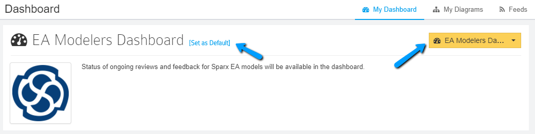
This setting takes higher priority than the dashboard which is set for you by the Admin.
Manage Dashboards
You can edit the existing dashboards and even delete them from the Dashboards page.
Delete action on a dashboard cannot be undone.
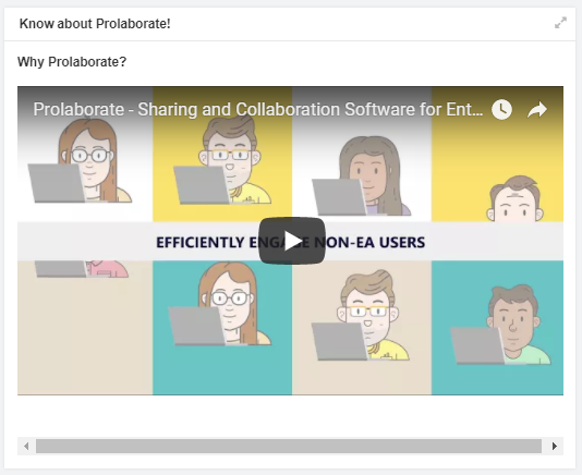
Check out the video guide of Dashboard Designer below: